Advanced Portrait Drawing
Advanced Portrait Getting Started
The first step in creating highly realistic pencil portraits is to equip your studio with the necessary materials.
To begin, you’ll need a wide range of graphite pencils, carbon pencils, and charcoal pencils.
In graphite, choose 6 to 10 pencils ranging from 8H (very hard) to 9B (very soft).
In charcoal and carbon pencils choose a range from HB to 6B or so.
Willow charcoal, graphite sticks, and larger sticks of carbon and charcoal will also come in handy.
Blending tools are crucial to producing realistic effects. Buy a wide selection of stomps and tortillon blenders, both large and small.
You should also have several pieces of white felt, different types of paper (notebook, typing, tracing, etc.), and a chamois cloth (available at art stores).
Test your blenders on a spare piece of your drawing paper to see the effects that are obtained with each of the different mediums.
You’ll need a kneaded eraser for certain, and it would be very useful to have a click eraser (like a mechanical pencil, but a solid tube of eraser), and an electric eraser with plenty of spare nibs.
Paper is the other must have, and countless types to choose from. Wood pulp paper will yellow over time, but is usually fairly inexpensive and is just fine for beginning drawings.
When you start creating drawings of a higher caliber, upgrade to a cotton-based paper such as a hot pressed watercolor paper.
Whatever you decide to use, make sure that it has low tooth (texture), and is sturdy enough to hold a lot of medium. Smooth paper works best for portraits.
Other tools that will come in handy include a compass, a ruler or triangle, a sandpaper block and small cup with a lid (for sharpening pencils against and then collecting the excess dust)
… a few paintbrushes for applying graphite dust or for blending, frisket film for masking white areas, tracing paper, and a razor blade or exacto knife.
In this course, expect everything—from the initial drawing to the final shading—to take longer than what you’re used to.
Pencil strokes must be kept clean and deliberate, shading must be worked up gradually and blended out repeatedly to render the most realistic skin tones possible.
When blending, begin in the dark area and slowly make controlled, layered strokes of medium moving with the contour of the object being shaded.
Begin with a soft pencil (4B or so) and when each pass is complete, go over the same area with a slightly harder pencil and increase the line length.
In this way, the shadow is developed from dark to light in gradual increments that don’t rely on blending tools for gradation.
When building up darks, work in small circles moving down the page from top to bottom and left to right.
Each new pass should overlap the last one slightly. When the entire area is covered, tilt the paper and cover the same area at a 45 degree angle difference to the right.
Cover the area again, then tilt the paper the other way and cover the area perpendicularly again.
This is a cross-hatching technique that will deliver even, dark tone. For particularly large areas, you can do the same movement using pieces of charcoal or carbon rather than pencils.
Advanced Portrait Layout
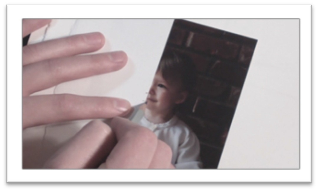
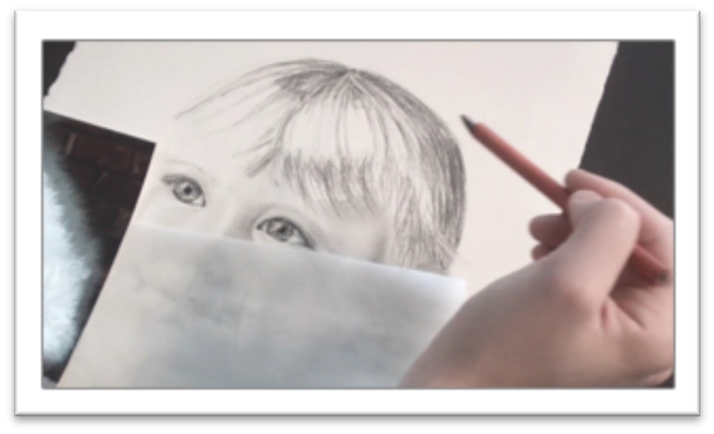
Use a high quality photo reference with clear features and good lighting to work off of.
You should be able to see enough detail to be comfortable increasing the size and the shadows should be gradual, with halftone, shadow, and highlight visible.
Sketch the rough head shape and angle on the page, reserving room for borders around all sides.
Work lightly, with a fairly hard graphite pencil; H or F are good choices. You should be able to see your lines, but also erase them easily.
Mark off guidelines for the nose and eyes.
You may be able to see these more easily by laying a piece of tracing paper over the photo, outlining the head, and drawing two curved lines, one that follows the shape of the head and cuts vertically through the center of the nose and another that defines the line of the eyes.
These lines will help determine the placement of the features on the face, so be accurate.
On your photo, use a piece of scrap paper to mark off the width of an eye. If the eyes are different sizes because the face is turned, use the largest eye.
Everything else on the face can be placed proportionally to the eye. Make specific measurements for your picture, but generally the eyes are one eye’s width apart and half an eye wide.
One eye width measured from the bottom of the eye is the bottom of the nose, and another eye width down from that is the bottom of the mouth. The chin generally falls about half an eye width from the bottom of the mouth.
Once you’ve guessed at the eye width, sketch it lightly on your paper and put the measurement in your compass.
Double check that all of the features fall in the right place on your paper using that width as a guide, and if they don’t, make adjustments.
You’ll either need to modify the size or placement of the eye, or change the outline of the head.
With enough measurements, you should be able to box in the basic shape of each feature before you begin drawing.
There should be guidelines for the width and height of everything, which can be lightly boxed in.
Draw the actual feature within this box, and you shouldn’t be able to go far wrong.
When you’ve drawn all of the features and double-checked them against the photo (several times) to make sure everything is placed where it should be, you can erase all the guidelines.
The only thing that remains before the actual work begins is to save your whites, and this is done with frisket film.
If you’re working small enough, you may be able to get away without masking the white highlight in the eyeball.
It can be scratched out when the drawing is complete using a razor blade, or simply avoided as you work.
However, if the drawing is fairly large, the best method is to sketch the shape of the highlight on your paper, trace it onto a piece of frisket film and apply the frisket to the drawing.
Tamp it down by rubbing over it with another piece of paper, not your finger, which will transfer dirt and oils to your drawing.
Advanced Portrait Eyes
Before you start darkening and shading the eyes, you should be absolutely certain that the size, shape, tilt, iris placement and pupil placement are correct, as those changes are harder to make the more finished your drawing becomes.
When you’re satisfied, outline the upper lid of the eye with a sharp charcoal pencil.
Use short, controlled strokes to make the line as smooth as possible; don’t try to cover the entire stretch of upper lid in one stroke.
Add some shading to the fleshy crease of the upper lid. Use a fairly light graphite pencil for this, such as H or F hardness.
Shade with short strokes that are close together and even, disguising your pencil strokes as much as you can.
When the graphite is on the lid, blend it out with a tortillon (use as large as size for the area as you can), or a chamois cloth stretched over your finger.
Use a mid-range graphite pencil to develop the eyebrows. It’s helpful to begin with the lower most lines, then do the uppermost hairs, and fill in as a last step.
That way your hairs stay inside the bounds that you determine and don’t become too random and hairy looking.
When the body of the eyebrow is in place, you can use a softer graphite pencil (2B or so) and darken a few hairs as needed.
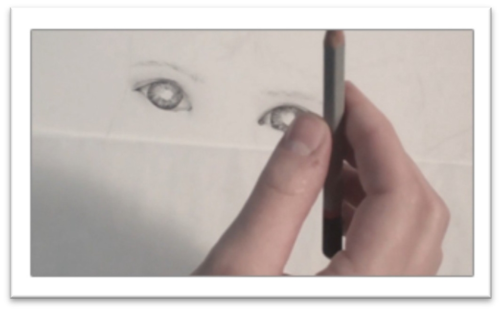
Ouline the iris, (colored part of the eye) with a sharp charcoal pencil. Avoiding the pupil, work with a very sharp 9B graphite pencil to lay in a series of lines in the iris that radiate out from the pupil and cover the entire area like spokes on a wheel.
They should be uneven in length—examine your eye in a mirror for good reference on the eye.
Blend the lines a little with a stomp, leaving some white in the eye as well, then re-darken lines as needed until the eye is the tone that you want.
Shade the skin around the eye using a mid-range graphite pencil.
Start in the darkest areas and work your way out, keeping the lines as close and even as you can.
In the very dark places, such as beside the nose on one side, start with a 2B
graphite pencil and then gradually trade out for harder pencils the closer you get to the highlight side.
When the skin tone is on the paper, smooth it just as you did the upper lid, with either a chamois or a large tortillon.
Use the motion that works best to hide the pencil strokes and deliver a smooth, evenly shaded surface.
That may be wiping the blending tool across the page in the same direction as the curvature of the face, or it may be working in small circles.
Next, sharpen a charcoal pencil to a very fine tip and lay in the eyelashes. Work from the bottom of the hair and pull up to form each lash, re-sharpening your pencil every few hairs to keep them very clear.
The eyelashes shouldn’t be placed until the shading on the eye is complete, to ensure that they don’t get smudged.
There are upper and lower lashes, but the lower lashes are generally shorter and finer, so you may want to use a harder pencil that will show up as lighter for them.
End by darkening the pupil and pulling out a few highlights in the corners of the eye and/or across the iris.
The largest highlight may have been protected by frisket. If that’s the case, leave it on until the drawing is completely finished.
Advanced Portrait Nose
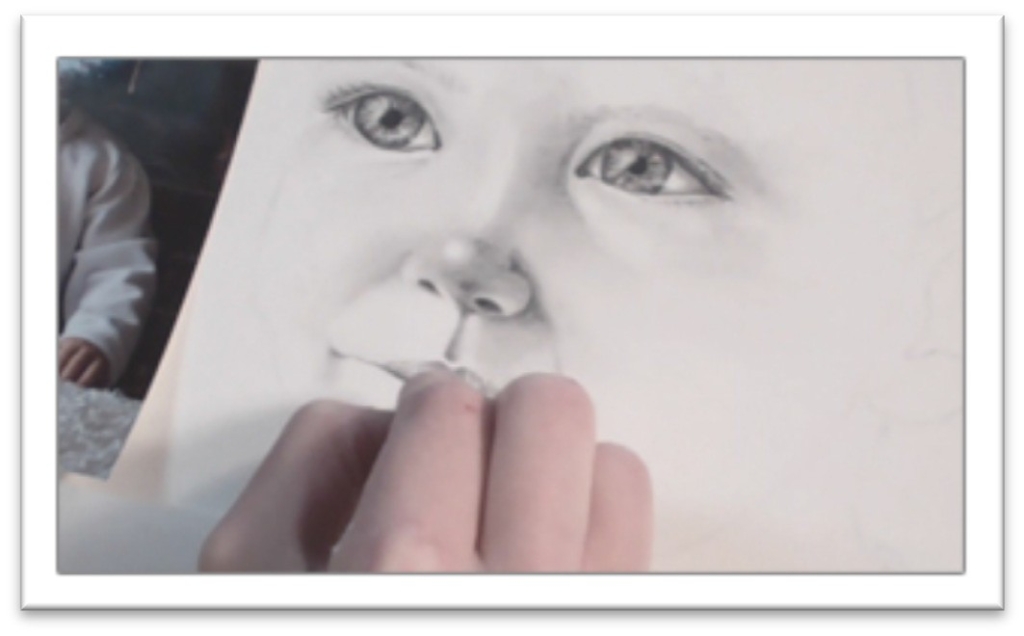
The nose can be tricky to shade because it has no definite lines, and yet has many shapes that need to be made distinct if it’s to look three-dimensional
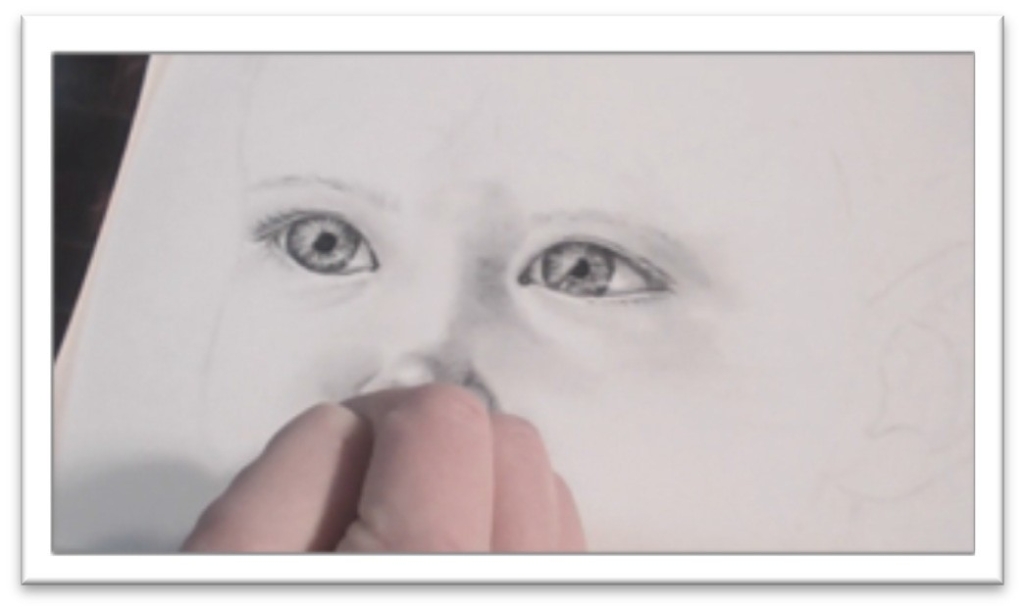
Begin by slowly laying in the general areas of shadow using a fairly hard graphite pencil such as H or F.
I begin on the lighter side of the face and work my way over to the shadow because
I’m so used to working left to right; you may wish to begin in the shadow side and that’s fine too.
Place your pencil at the edge of the nostril at each new stroke and move outward, so the darkest part of the pencil stroke is also helping to define the line of the nostril as you shade.
Put a mid tone of graphite all over the nose and up the bride on the shadow side, avoiding the highlight on the tip of the nose.
Blend the initial layer of graphite using a tortillon or piece of chamois cloth stretched over your finger.
Blend in small, directional strokes in the nose, helping to emphasize the contours by blending with them.
Because blending picks up the medium and lightens it, you need to re-emphasize the darkest areas after each round of blending.
You’ll find that the tip of the nose is like a ball resting on the nostrils, and as such as darks underneath and on the side.
In most lighting circumstances, one side of the nose is much darker than the other, and the tip of the nose may even cast a shadow onto the cheek.
Darken those places with a 2B graphite pencil or even softer; it’s always better to upgrade to a softer pencil and continue to lay down light strokes than it is to press harder with a mid- range or light pencil, because doing so will almost certainly result in visible lines.
After each new addition of graphite, blend carefully with the chamois or tortillon.
When the skin tone of the nose is finished, darken the nostrils with a very soft graphite or charcoal pencil, and pay attention to the tones dictated by the reference photo.
One nostril may be lighter than the other if the head is tilted.
If that is the case, it’s easy to lighten the too-dark nostril either by blending out the tone with a tortillon or blotting it with the kneaded eraser.
Finally, look over the nose carefully and make sure that your areas of reflected light in the shadows are distinct from the halftone and the shadow areas.
You may need to blot them with the kneaded eraser to make them lighter, or add more medium over the top to darken them.
An HB charcoal pencil can be used over the top of graphite to darken the shadow edge of the nostril, the dark side of the bridge, and other places that may need it.
Advanced Portrait Lips
Before you begin shading the lips, make any necessary changes to the shape by adjusting lines with a 3H pencil.
You want the lines to be very light, especially in the bright side of the face but you need to have a distinct edge so it’s clear where the lip begins.
Lay an even layer of light tone over the surface of the lips with a fairly hard pencil such as an H.
Follow the curvature of the lips as you work, and use vertical strokes on the top lip, then the bottom lip
Don’t scribble over the entire area or change direction. When the tone is on the lips, soften and blend with a chamois or tortillon.
Next, begin to darken the line between the lips with a very sharp 2B charcoal pencil. The corners of the mouth are also dark.
Soften the line with a tortillon, then begin adding darker areas of tone on the lips by building up what’s already there with another layer of H or F graphite.
The upper lip is usually darker than the lower, and the lips are both darker the closer they get to the opening of the mouth (the bottom half of the upper lip and the upper half of the lower lip). Blend the tone again.
Begin picking out some highlights and lines in the lips by using your kneaded eraser squashed to a fine point.
There are usually strong highlights in the center of the lower lip if it’s visible, and fine vertical lines cross both lips. These are similar to the spokes in the iris, but lighter.
Emphasize a few of the pucker lines in both lips by darkening one side of the highlight lines with a sharp graphite pencil.
Blend carefully with a tortillon, avoiding the highlights if you can so that you don’t have to pick them out again.
Shade the skin around the lips to show the curvature of the face.
There are subtle lines that extend from the outside of the nostrils down to the corners of the mouth but work very lightly or you may over- emphasize them.
Shade with an H pencil to begin (or harder in the bright skin tones), and lay in smooth tones by using long strokes that follow the curve of the face.
When the first layer is down, go over the strokes again in a perpendicular direction to disguise the lines.
You may even go over a third or fourth time, depending on how dark you want the tone to be. Blend with a chamois to finish.
Advanced Tutorial Chin and Cheeks
Depicting skin tone in graphite is one of the most important—and difficult— tasks to accomplish in rendering a realistic portrait.
The method is nothing new, but because the skin covers such a large area, blending a smooth tone becomes more and more difficult.
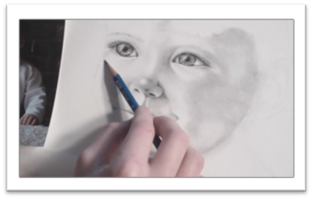
There are two ways to work. One way is to begin with your 2B in the darkest shadows of the skin and gradually change your pencils for harder and harder leads as you extend toward the light areas.
I prefer to map out the shapes of the darks on the face by lightly sketching them with a 6H pencil, then filling in that tone with a 2H graphite pencil.
When the first layer of pencil is down, smooth the face by gently wiping over it with a chamois cloth.
Then turn the paper at an angle to the right or left and lay down a second layer of tone, this time in the darker areas of the face.
Think of the first 2H layer as the baseline for the halftone (the skin facing the light that isn’t the highlight).
The second layer, placed with a slightly softer graphite pencil, begins to define the areas of reflected light in the shadows. Blend again.
Turn the paper at an angle the other way and build up the darker areas in the shadow side of the face using an even softer graphite pencil.
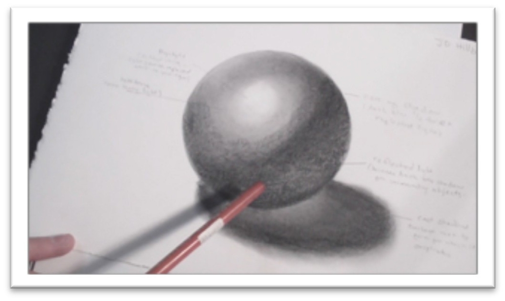
There are three basic steps (lay down halftone, lay down reflected light in the shadow, lay down shadow), but that doesn’t mean that you’ll be able to complete each step in one pass.
You may have to do each step with several layers of graphite, blending between each one.
You may finish the darkest areas and find that there’s not enough contrast between them and the halftone and need to build it up farther.
If you need more dark tones at the end and don’t want to lighten the graphite by blending, you can dip a soft, dry paintbrush in powdered graphite and paint it on the surface.
Apply it in the same motion you use for blending; follow the contours of
the face, don’t circle in the large areas.
To blend, just continually paint over the surface again and again—you don’t need to use the chamois in addition. For best results, use the largest brush you can for the area.
The great point is that you build up your tones GRADUALLY. Your eye will see more contrast on the photo than is realistic, because the camera flattens the surfaces and emphasizes contrast with flash.
The tones almost become saturated on a photo. So, while you use a photo for reference, don’t stick to it as the end all of making realistic portraits.
Draw the way the naked eye sees, not the way the camera sees.
Another tip: as you work, keep your hand anchored on the paper that you’re using to protect the drawing.
You’ll have better control over the strokes and will be able to produce a more even skin tone and cleaner lines.
Advanced Portraits Ears
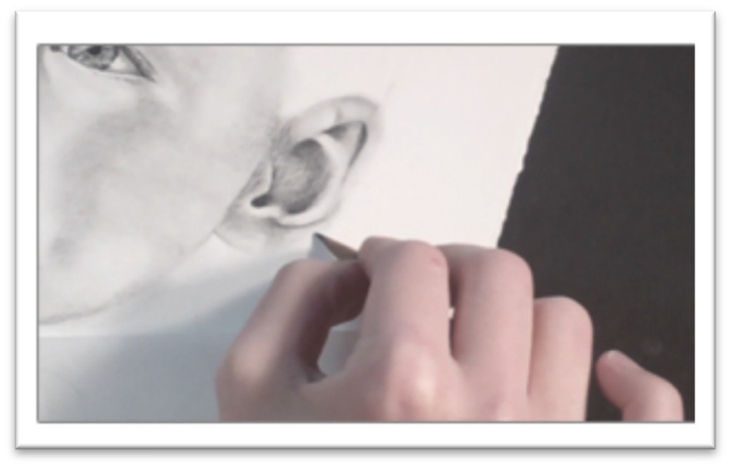
The ear is really a continuation of the skin tone, so many of the same techniques will be utilized.
There is often a transition in tone from the cheek to the ear, since the ear rests on one side of the face so you want to show that without making a stark line of change.
Begin by laying in an even skin tone over the entire surface of the ear.
If the ear is on the shadow side of the face, even the lightest tones will be darker than the highlights, so everything needs to be covered.
Blend this tone with a large tortillon or stomp, moving with the small curves of the helix.
Darken the interior curves of the ear with a 2B pencil. There is a very dark area in the opening of the ear going down to the ear drum, so this may need to be pushed even darker with a charcoal pencil.
Don’t start there, though—build it up slowly so that the feature develops as one working piece.
Developing the feature this way, it’s easier to make adjustments as you need them instead of laying down tone that is too dark and then having to either lighten it later or darken everything else to make it look right in the context of the whole.
Blend out the darkest areas by working in small circles with a harder graphite, such as an F or B pencil.
Layering harder leads over the soft ones will fill in the tooth of the paper and develop a transition naturally, which means you get a gradual look without lifting any tone as you do when you rub over it with a blending tool.
Keep a careful eye out for areas of reflected light and individual characteristics of the ear you’re drawing.
There is often reflected light in the flat interior area of the ear, on the bottom edge of the lobe, and on the outermost edge.
Use a 2H or harder pencil to better define the outline of the ear against the white of the paper, then blend it into the drawing with a stomp.
You want a distinct edge, but not an outline so always blend your lines into the drawing.
Take a step back from your work and examine the ear in the context of the whole.
If the shadow side of the face seems too light beside the ear, you can darken it either by laying in more pencil tone in the cross-hatching technique, or by painting graphite dust on with a soft paintbrush.
Use a larger brush for smoother tone, and blend it both by brushing over the surface several times with the brush and by smoothing over it with a chamois cloth.
Advanced Portraits Neck
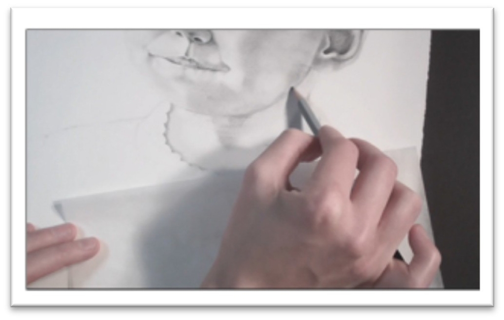
The neck is a continuation in style and technique from the skin tone, except for the cylindrical shape and the prominence of underlying bones and tendons.
Because the chin juts out in front of the neck, there is often a cast shadow beneath it along with reflected light.
Pay close attention to your reference to get the subtle shading that indicate the Adam’s apple, collar bone, and the muscles on either side correct.
Begin by laying an even tone over all but the lightest areas of the neck, using a 2H pencil.
As you work, sketch guidelines for yourself that show the shapes of the darkest shadow and highlights. Crosshatch in the dark areas with the 2H and blend with a chamois.
Use a softer pencil such as a B to begin laying in the darks over the first tone. Work in smooth strokes, starting in the darkest areas and moving outward following the curvature of the neck.
Develop these tones up gradually. Your goal is not to make the darks match the darks in the photograph, but to stay consistent within the context of your drawing.
In other words, the dark tones in the neck should only be as dark as the face tones.
To keep from making the neck too dark, you should constantly be stepping back as you work to take in the drawing as a whole.
Blend the B layer, and if needed, crosshatch over the darker areas to build them up. If there are lines in the skin of the neck, pick them out with a kneaded eraser pressed flat, then emphasize with a 2H pencil.
If you can see a shirt collar in te picture, the clothing will cast a shadow on the skin of the neck.
To make the transition from neck to cloth sharp without outlining, use a dark pencil on the skin tone and work in small circles next to the clothing to build up a shadow area.
There should be enough graphite on the page that even after blending it will still read as shadow.
On the shirt itself, pick out a highlight with the kneaded eraser right where the shadow ends and the shirt begins.
Make the highlight as clean as possible. The abrupt transition will make that shirt pop forward and the shadow lay flat on the skin.
Finish by blending the neck tones with a flat brush. The bristles can be synthetic or natural as long as they’re soft enough that they won’t damage the surface or put down a texture.
You should have a selection of sizes and types of brushes on hand for blending different areas of your drawings.
Always work with the biggest brush possible for the area to make the smoothest tones possible.
Advanced Portraits Hair
Develop the shape of the hairstyle with directional strokes of an F graphite pencil.
You want to map out the areas of light and dark and get a feeling for how the hair falls on the head.
The darkest parts of the hair are usually at the top of the head and near the neck, but consult your reference photo carefully.
Use short, vertical strokes at the boundaries of the dark shapes so that they can be blended in to the rest of the hair easily as you work.
Sharpen a 2B charcoal pencil and, starting in the darkest parts, lay down lines of hair. Fluctuate the pressure to get lines of varying thickness, and use the pencil on the side to build up the solid dark areas more quickly.
Avoid the areas that you’ve marked off as highlights for the most part, stroking through them only occasionally with charcoal lines.
When the charcoal is in place, blend over the body of the hair with a soft paintbrush such as squirrel hair to gently smooth without lifting too much of the texture.
Do not use a cloth or tortillon, as these will take out the texture and make your hair look too much like the skin tones.
Go over the highlight areas with a sharp F or 2H graphite pencil. Whenever you can, start from the top of the head and draw the hair down in its natural growth pattern.
You don’t want hairs growing every which way.
At the same time, though, watch that you don’t make hair that is too regular and even.
There are always some loose strands, some flyaway hairs, and some strands curving in a different direction than the others. Keep this in mind as you work.
Don’t be afraid of contrast, even in the light places.
The highlight isn’t a perfect semicircle of white sitting on the head, because the hair isn’t smooth like a balloon.
There will be light and dark strands breaking into the highlight where the light bounces off the surface irregularly.
Brush over the hair again after the highlights have been placed, then use the click eraser or electric eraser to take out a strand or to in the dark areas.
These may cross the hair in the other direction, or fly out to the side—do something to lift up a few hairs and make the entire area more realistic.
There are also flyaway hairs around the outside of the head, which you can place using a hard, sharp graphite pencil. Use broken lines so that the hairs appear to be struck with light.
Advanced Portraits Clothing
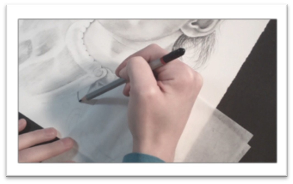
As you develop the clothing, keep in mind that in order to create the impression of cloth, you’ll have to use a different rendering technique on it than you did in the skin or hair, or it won’t read as a new texture.
Begin by laying in a light tone in graphite that will help you to see the shadows and folds in the cloth.
When all but the most light-struck areas are covered, blend a little over the top to establish a smooth base tone.
Once the base is established, you’ll keep the texture rough by working with fast pencil strokes that follow the line of the fabric and avoiding blending as much as you can.
Examine the reference closely to get a sense of where to place the darks, halftones, and highlights in the cloth.
The part of the fold that is pushed under will probably have a strong core of shadow surrounded by reflected light areas. These should be kept darker than the halftone of the upper lips of the fold, but lighter than the shadow core.
Put in the darkest area with a 2B, working out toward the light with smooth, gradual strokes.
Follow the curve of the fold as you work so that the fabric remains consistent.
If there are buttons or other perfectly round shapes, use a template to sketch them in place.
Templates also come in handy in drawing precise patterns on clothes, so invest in a set of circles, ovals, squares, and angles to start.
They can be purchased at any art or hobby store. Keep the template over the shape as you fill it in, and you won’t have to worry about leaving directional strokes in the tone.
If you’re drawing knit fabric as in the example, you can start to develop the details of the cords by erasing lines carefully with the kneaded eraser (making sure to follow the curve of wrinkles as you come to them), and by then emphasizing the white line with pencil line on one side of it.
Take your time and be finicky with yourself—you’ve already invested hours into the rest of the portrait, so the clothes need to be just as carefully done.
Lighten up areas by blotting and gently rubbing with the kneaded eraser, and continually step back as you work to see how the fabric looks from the normal viewing range of three to five feet.
When you need to depict lines but don’t want to outline, give the impression by darkening one side of the “line” and lightening the other. The cleaner the edge is, the better.
End with the smallest details. If you can see holes in the knit fabric, add a few to your drawing here and there.
Pick out a highlight on the button, make a few fuzzy lines stand out from the sweater. The trick is not to over-do it.
Less is always more, but having those little details correct can really pull the portrait together and give it a professional, polished look.
Remove the frisket film from the highlights in the eyes. Oftentimes, the highlight needs to be made smaller, so use a sharp charcoal pencil and touch it up.
When everything looks right, you can spray the drawing with fixative to keep it from smudging.

