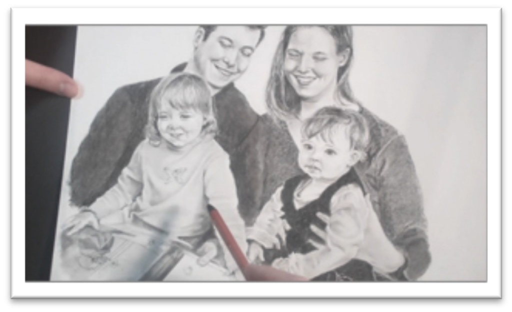
Draw Portraits For Beginners
Class 1: Drawing Family Portraits Layout
Choose a paper with low tooth that is high quality, such as Bristol board.
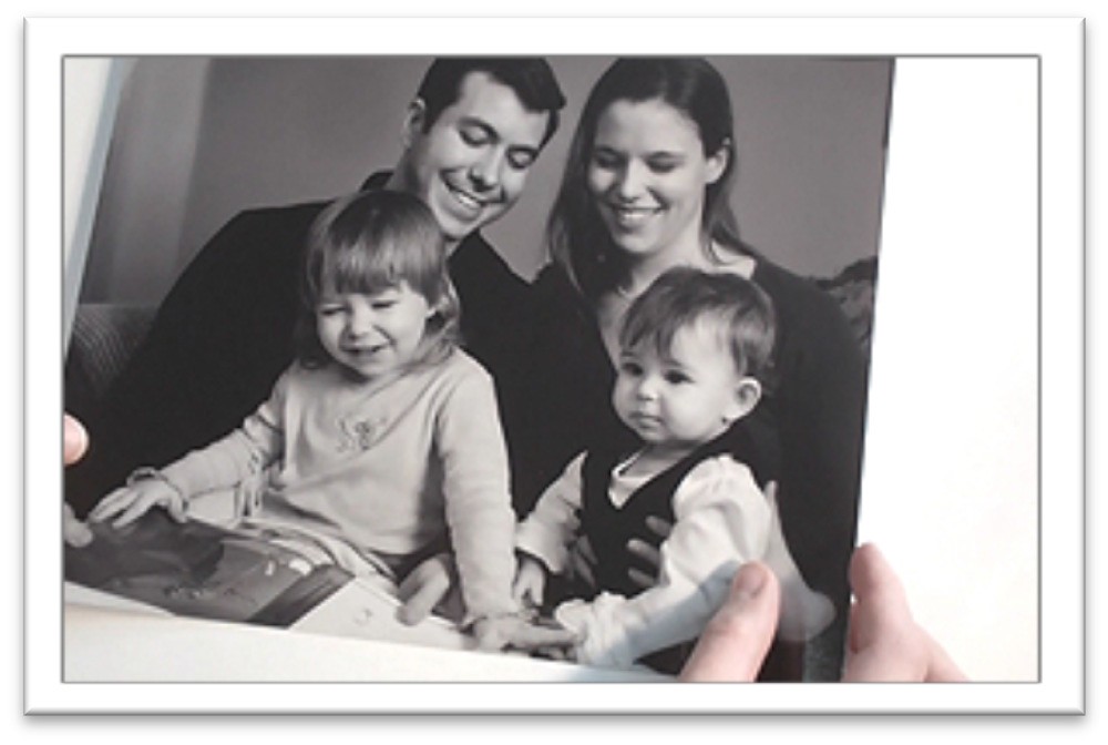
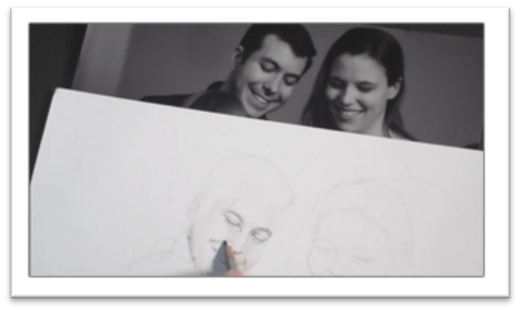
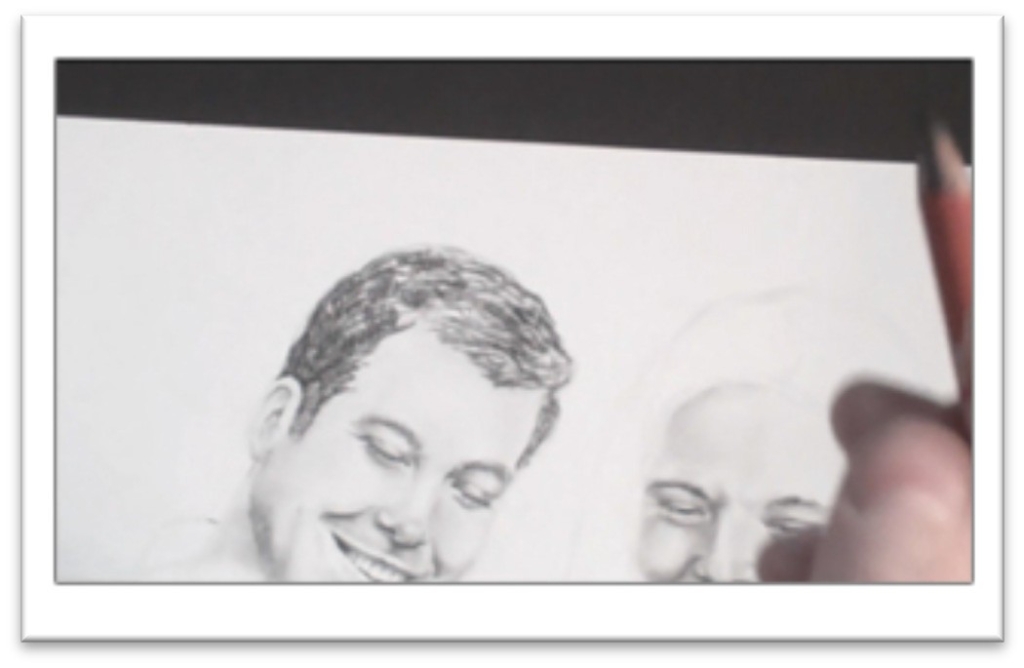
Start the layout by sketching the basic angles and shapes of the heads on the page to get a better feel for the approximate size you to make things.
Use loose, light strokes, working clockwise from the upper left hand corner down and focusing on the largest shapes first.
Keep your pencil work light enough to erase easily. The sketch should be fairly accurate, but don’t get bogged down with anything but how the largest shapes interact with each other at this stage.
Erase the lines that you don’t need, then start refining the drawing with measuring. Use the largest head to determine relationships with the smaller shapes
Place a scrap of paper over the head and mark off the length, then compare it to the other heads in the photo.
Do the same thing with the head’s width, then transfer those proportions to your drawing.
For example, if the father’s head is the same length as the mother’s in the photo, make sure that they’re the same length in your drawing as well.
When you have the adult’s faces in relation to each other, do the same thing with the children’s heads, using the dad’s head as the basis of measurement.
As you work, look for intersections of the shapes on the photo and compare them to your drawing.
For example, the father’s shirt collar may touch the child at the center of her head, or an arm may line up with someone’s nose and so on.
Also look for the negative shapes and compare them to your drawing as well—the shape between to heads nearly touching, the shape between two hands, et cetera.
Make your drawing as accurate as you can in the early stages. If you want to combine photos or make other changes, you can do that after you know the layout is correct.
The roadmapping, information-gathering phase of the layout is done when all of your large shapes are correct in themselves and in relation to one another.
The next step is to start filling in smaller details of the portrait. Vertical and horizontal guidelines on each face indicate where
the nose and eyes belong.
Next, use the scrap paper system to make measurements for features.
Working in the uppermost face first, place your paper over the photo and mark off the eye’s length.
All of the facial features can be placed in relation to the eye; double-check the
common measurements against the photo before you begin drawing them on your page.
Generally, eyes are one eye-length apart and half an eye wide. From the bottom of the eye to the bottom of the nose is an eye-length, and so on.
Use the eye as your basis of measurement and determine the width and length of each feature on the face, then sketch an appropriately sized box on the drawing to show where each feature will be placed.
You can draw the lines of the features within those boxes once you’ve measured and re- measured to make sure they’re correct.
Clean up the guidelines once all of the features are lightly drawn in place, and then you can start adding tone to the face.
Class 2: Drawing Family Portraits Father’s Face
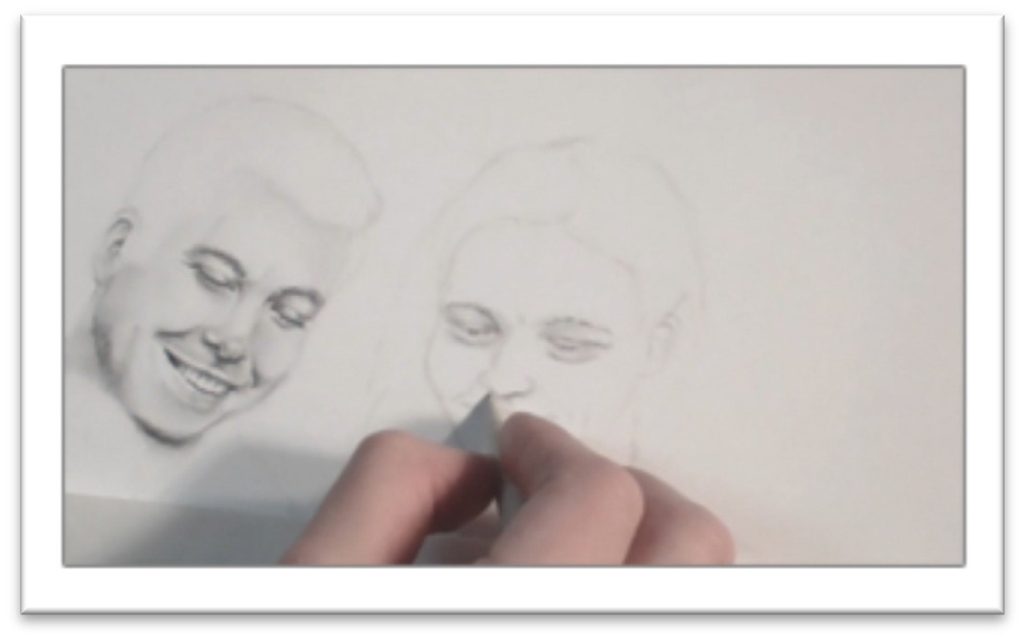
Pick up an H and 2B graphite to have both on hand for light and dark places of the face; H for most of the skin tone and a 2B for darker areas.
Start by bringing out the dark lines of the face that help to define the key features; the lines of the eyes, bridge of the nose, nostrils, lips, and ear.
Don’t outline, just define them a little more clearly. Next, build up some skin tone starting in the darkest areas; above the eye, side of the nose, underside of the tip of the nose, corners of the mouth, and so on.
As you shade, constantly look for shapes of shadows on the face as a whole, versus focusing on individual features.
When the tone is down, smooth over it with the largest blending tool you can. Felt or chamois is best for early stages in a drawing because they give the smoothest finish.
For smaller areas, choose a stomp or tortillon which don’t pick up so much tone and allow for more accuracy.
After smoothing, build up the darkest places in the skin with more tone. Pick out highlights with a kneaded on the tip of the nose, in the eye, on the mouth and anywhere else you find them.
If the person is looking down, the eyes are easily defined with lines that indicate the upper and lower lids. There should be some shading in the corners and a highlight on the top of the upper lid to show that the eye is round.
Blend the skin around the lids, then place the eyelashes with a sharp charcoal pencil. Each lash should be one stroke, drawn in the same direction that the hair grows.
When drawing eyebrows, shape the upper and lower lines first, then fill in the eyebrow with tone and pick out a few hairs with a kneaded eraser and a charcoal pencil.
The nose is usually dark under the tip, with an area of reflected highlight both on the side of the bridge and in the septum between
the nostrils there that helps to lift it up and out.
There’s a strong highlight on the tip and the highest line of the bridge which you can pull out with a kneaded eraser.
Use a charcoal pencil to darken the nostrils when the rest of the nose is done then blend that tone out with a small tortillon using a circular motion that will disguise the strokes.
Define the mouth with just enough light lines to indicate the shape, then build up the tone with graphite.
The upper lip is usually darker than the lower, the corners are darker than the middle, and there is more detail visible on the lower lip.
If teeth are visible, show where they are by drawing the shadow around the teeth, not the teeth themselves.
It’s very easy to over-draw teeth, so avoid that tendency by barely drawing lines of division, relying on the viewer to fill in the lines of separation for you.
Lay some graphite tone over the entire ear and blend it smooth, then darken the interior lines with soft graphite and in the darkest places, charcoal.
Blend the dark lines out with a small tortillon, and if necessary, clean up the other side of the line with a kneaded eraser.
Look for areas of highlight and reflected light and pick them out with a kneaded eraser to finish.
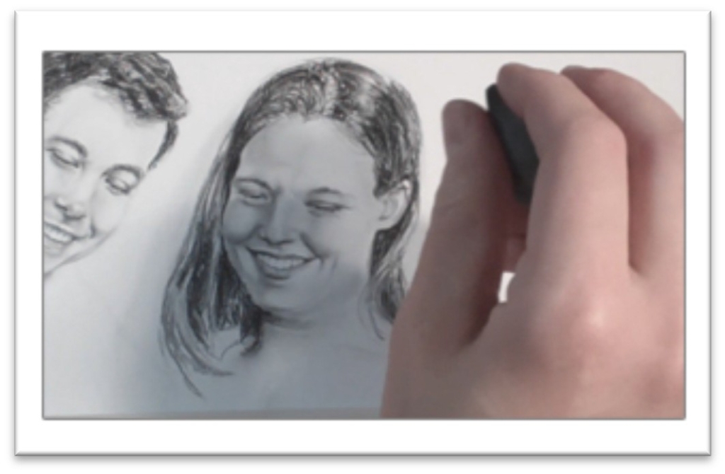
Class 3: Drawing Family Portraits Mother’s Face
Begin with the H graphite and work the same way that you did in the Dad’s face darkening the largest shapes so they don’t get lost in blending and to get a better idea of how the face looks with more contrast.
Make adjustments in the features as needed, then work up some darks in the eyes with 4B graphite.
Place heavy lines in the iris and blend out, starting in the darkest areas. For the lighter areas in the eye, use 2H or 4H.
Blend with a fresh stomp or tortillon to make sure you’re blending existing tone rather than laying down additional darks.
Use an H and start laying in areas of tone in the rest of the skin, remembering that you need tone everywhere in order to show highlights.
Work in controlled strokes, covering the entire surface, then blend it smooth with a chamois cloth. This is fast way to get an even coating over the face, and then you can pick out highlights with the eraser later.
Once the base tone is blended smooth, lay in a few of the darks with a charcoal pencil; above the eyelids, the eyelashes, the nostrils, and so on.
Don’t push it too far—you should work on the whole face at the same time, progressing up gradually.
Begin picking out some of the highlights on the more finished areas; on the eyelid, bridge of the nose and so on.
Then continue to build up dark areas of the skin, always following the natural contours on the face.
Put the shadows in as shapes that cross the lines of the features and then blend with a clean tool, using the largest thing you can for the space to ensure a smooth finish.
Draw teeth by developing the darks that are around them, not by outlining the individual teeth, which will make them look over-worked and cartoonish.
Add more shading, constantly taking a step back and comparing the contrasts between the two faces on your drawing to make sure they appear consistently lit.
Remember that the corners of the mouth are very dark, as are the corners of the mouth. Darken them with a sharp charcoal pencil to make them push back realistically.
You will also want charcoal in the eyelashes and eyebrows, and perhaps in the lines beside the nose if the person is smiling.
If lines on the face are apparent, blend them out so they don’t look artificial. When blending a line, blend on only one side to keep it from looking smeared.
That way, the contrast will remain distinct.
On the neck, lay in the dark tone using light pressure with a charcoal pencil, blend with a chamois or felt by stroking horizontally with the contour, and then pick out lines with the eraser to indicate the folds in the neck.
Accent the white line with pencil tone and blend to make the transition less distinct.
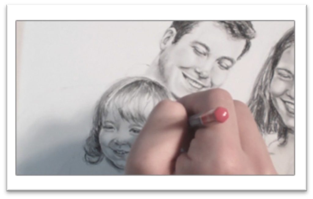
Class 4: Drawing Family Portraits Child’s Face
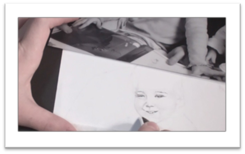
Begin with the F pencil, darkening up the nose, eyes, mouth, chin, and shape of the face to make them more clean and distinct.
Remember, there are no lines on the face, so don’t over-draw the features; just give yourself a clear roadmap for adding tone.
Switch to a B graphite and put in the crease above and below the eye, then lightly start to shade the face with the essential shadow shapes.
Take into account that young kids don’t have the same amount of contrast as adults, so work up the base tone with a harder pencil such as a 2H and keep it lighter.
You still need to have tone everywhere, however, so that you can make highlights stand out.
Blend the initial skin tone with a chamois or large stomp, and then start bringing out the reflected light around the chin and cheek area.
This is the line of highlight that exists around the curvature of the face, so you need to develop the negative shape (the shape of shadow behind the face) in order to see it, but in the early stage, simply leave a small band of white around the edge of the face and darken tone beside it.
Darken the eyes with a 4B for the iris and corners and a 2H for the tone in the whites. Add eyebrows by laying down graphite for a base tone, then accenting the shape with individual hairs drawn in with pencil and pulled out with an eraser.
When the base skin tone is blended, you can begin to accent the darkest areas with a sharp charcoal pencil. In the eyes, go over the corners and lines in the lids, as well as the eyelashes.
Remember charcoal is softer and will blend more easily, so make sure you have the blending done before you lay it down, or it will smear.
As you work, pull back every few minutes and examine the picture from a distance. If you’re working flat, prop the drawing against the wall to see it from different angles.
It’s surprising how many problems you can catch with just this simple step, so do it often.
When drawing kids’ teeth, consider that their teeth are smaller and more gappy, but otherwise they should be defined the same way as the adults; by shading the negative shape around them.
The ear, chin, and cheek may be defined the same way.
As you lay down dark areas, make sure that you’re using a softer pencil rather than pushing harder on a mid-range one or your tone will be streaked with lines that are almost impossible to get rid of.
Work up more shadows in the individual features and blend with a stomp with a little bit of tone on it for the small areas.
Blend using small circular strokes that give a smooth finish and disguise directional strokes.
Finally, darken a few areas with a sharp charcoal areas; the nostrils, mouth, nose, and so on as needed.
The darks should clean up all of the ambiguous areas and make the picture pop with realism.
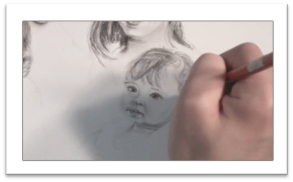
Class 5: Drawing Family Portraits Baby’s Face
The same rules apply for the baby, except that the tones and contrasts are even lighter.
Babies look like they have large eyes because proportionally, the ratio of head to eye size is smaller than in adults.
For that reason, it is very easy to make a baby’s eyes too large, so a good plan of attack when drawing a baby is to start with the eyes.
Since everything is measured in terms of the eyes, you shouldn’t go too far wrong.
Darken the features with F graphite, then begin laying in darks with a 4B. Work in the eye, adding heavy tone to the lines of the eyelids, the nostrils, and the mouth.
Add some spokes to the iris in the eyes and blend it out, then add some tone in the whites as well. If the eyes are too small to avoid the highlight in the corners, you can pick out white areas with a razor blade when the rest of the drawing is done.
Blend the skin tone around the eye with a small stomp or tortillon, then use a sharp charcoal to add the eyelashes—one stroke per lash, working in the direction of growth.
Then use an 2H pencil on the side, starting in the darkest areas of the face, and lay in some skin tone.
Use smooth, controlled strokes that follow the contour of the face. Work up gradually, but don’t be inefficient—the darkest areas can be put in with a softer pencil.
Accent the roundness of the baby’s cheeks with fairly strong shadow beneath the apples, but keep shading in the chin and forehead very light.
There isn’t much contrast yet because the baby’s face is soft and round with very little visible underlying bone structure.
Babies usually have very distinct lines around the eye, nose and mouth. Draw those lines with a sharp graphite pencil, then blend over the entire skin tone with a chamois to soften.
Next build up the darks of the skin tone a second time, blending in the smallest areas with a stomp or small tortillon using circular motions.
Look for the subtle shadow shapes in the reference, but be aware that the longer you stare at the picture, the darker the shadows will appear to be.
If you don’t stop and step back every so often to get a broader perspective, you will tend to over- darken the tone.
Bring out contrasts in the nose, mouth, ears, and beside the cheeks and chin with the sharp charcoal pencil.
There’s a nursing callous on the upper lip of all babies, which you can accent with a bit of line and a kneaded eraser.
The mouth is very sharp and distinct as is the divot above it, and there is usually a strong highlight on the lower lip to show that it’s wet.
Once the face is fairly close to completion, focus on the small details. Remember that shadows are darkest closest to the source, and then blends out to a reflected light.
Blend a smooth base tone over the neck, then add lines and highlights to show rolls of skin on the neck. Darken under the chin and one side of the neck with charcoal if necessary to finish.
Class 6: Drawing Family Portraits Dad’s Hair
Start by solidifying the lines that determine the hairstyle shape and the shape of the head.
Indicate the placement of strong shadow or highlight shapes by outlining the shapes using short, broken lines that follow the direction of hair growth.
These lines will serve as a roadmap when you begin adding tone, and they are easier to blend in if they follow the hair growth.
Indent a few white lines to serve as highlights using a stylus or a sharp hard graphite pencil over a piece of tracing paper.
The indented lines will remain white even after heavy tone is laid over the top, so it’s a useful tool for bringing detail into areas of heavy darkness.
Avoid the temptation to scratch out more than a few hairs, however. Less is more.
Use a charcoal pencil to begin building up tone in the hair, always following the growth pattern as accurately as you can.
Concentrate as you work and visualize how the hair is growing. If the hair is short, keep your strokes short. Try to imagine yourself creating the hair with the pencil strokes.
The matte black charcoal is used in the hair to help push the graphite face tones forward, so make sure to use both mediums in your portrait for best effect.
When you come to features that are defined by the hair, such as the ear, cheek, and forehead, draw the line lightly, then build up charcoal right up to the line, working in circles that will hide the outline.
Blend lightly in places with a stomp to fill in the white speckles that always result when you use charcoal.
You’re polishing the tone more than blending it smooth, though. If the hair gets too smooth, it will match the skin too closely.
After blending, use a graphite pencil to develop the shadows on the skull that are cast by hair lifting up off the surface of the head.
These shadows should look like loops, with a light area at the top closest to the hairline.
Use the graphite to draw a few loose flyaway hairs that lift off the outside and inside of the hair style as well, and fine hairs in the hairline.
Break through the hairline with the kneaded eraser and add a few hairs there with a sharp charcoal pencil if needed.
You may also need to connect highlight shapes in the waves by erasing some of the tone there.
Use the kneaded eraser to stroke over the hairs that were indented with the stylus as well, so the white core remains, but the hairs don’t look artificially sharp.
Finally, step back and look at the picture from a distance. Once the hair is in, it often changes the contrasts on the face.
You may need to darken the eyebrows, eyelashes, or other dark areas of the face to keep them from being washed out.
Class 7: Drawing Family Portraits Mom’s Hair
Start laying in the directional strokes with a graphite pencil to begin what’s going on in the hairstyle.
At the end of this stage, you should know where the part is, how far down on the forehead the hair falls the outline of the shape of the hair, and the placement of major shapes in the hair.
When you’re confident that everything makes sense and looks natural, use a stylus or sharp graphite pencil over a piece of tracing paper to indent a few individual strands.
Limit yourself to only placing hairs in areas where it will be difficult to pull them out with the eraser later, and where they’re necessary to explain what’s happening in the hair.
For instance, you may indent a few lines in a curl, in the dark areas where a hair or two crosses the others, or where individual hairs are distinct against clothing or background.
Switch to a charcoal pencil to lay down the tone, always following the direction of the hair growth.
Think of this step as laying in the mass of tone, not individual strokes. Look for the large shadow shapes as you work to help simplify the form, and avoid the shapes of highlight for the most part, breaking through once in a while to show that the hair isn’t smooth, but uneven.
As you lay in tone around the cheek and ear, those shapes will become more defined. Take a step back before you build up the darks very heavily.
You will often find that the hair seems smaller after filling in the tone, so make sure that the outer shape is correct by re-measuring against the photo.
You may also need to make adjustments to the head shape, ear, cheek, or chin.
When tone has been laid over everything, blend lightly to change the base tone to off-white and to fill in some of the texture, but don’t over-smooth the hair.
You want to retain the rough texture so it will contrast with the skin.
Add hairs that are falling down on the forehead and pull out the highlights more cleanly with the kneaded eraser then break up any apparent white stripes with strokes of charcoal or graphite.
Once the hair is in place, you may need to make adjustments to tone on the face.
Use a 2H, which gives a smooth, finished tone without blending.
When you’re satisfied, add some more flyaway hairs around the skin and on the outside of the hair.
Blend again if needed, and pull a few dark strands out with the sharp charcoal pencil to finish.
Class 8: Drawing Family Portraits Kid’s Hair
A little girl’s hair is drawn much the same as an adults, but the hair usually has a finer texture and in this case, it is also lighter in color.
For those reasons, put in the initial strokes that show direction of hair growth with a 2H pencil.
Map out the shadow pattern with short, vertical strokes that are easy to blend
in, and indicate the bangs, cowlicks, curls, and all other features specific to her.
Press in some indented highlights with the stylus, then build up tone with the charcoal pencil, starting at the top of the head in the darkest area.
Don’t press hard; the pencil should actually skip over the surface. Build up tone gradually, following the growth of the hair and starting in the darkest areas first.
Avoid the shapes of highlight for the most part, breaking though the shape only occasionally to keep it from looking too smooth and regular.
In areas right beside the face, lightly draw the line and then use a charcoal pencil to circle strokes right up to the line, hiding it.
Make this line as definite as you can, and the face will pop forward with the contrast.
Children’s faces are much rounder than adults. As you develop tone on the hair, think of shading a balloon; the top and sides of the head are darkest.
Darken tone by going over the same area over and over rather than pressing harder, and even in the early stages of laying in tone you should still follow the direction of the hair growth.
Blend lightly over the main body of the hair with a large tortillon to fill in the charcoal texture a little bit.
Because the child’s hair is smoother than the adult’s, you can smooth it a little more to make it look softer.
Once the tone is blended, go back in with the charcoal pencil and re-darken the darkest areas.
Accent shapes in the hair by alternating between the charcoal pencil and a kneaded eraser, darkening and lightening as needed.
For instance, shade a curl by pulling out a highlight on the most outward point, then break across that highlight with a few charcoal lines.
Follow this same procedure throughout the hair wherever there’s a highlight.
Pull out small highlights in the body of the hair with the kneaded eraser, including a few strands that cross the top in the opposite direction.
Darken one side of these light strands to make them pop forward even more, and add a few final flyaway hairs along the outside of the hair to finish.
Class 9: Drawing Family Portraits Baby’s Hair
The baby’s hair is fine, but in this case it’s also quite dark.
Baby hair is also usually fairly scraggly and messy, so before you begin sketching it, make sure that you want it to look the way it does on the photo.
If you want to make changes, gather references that show the hair the way you want it to be so you have something to look at.
Draw lines that give you a clear roadmap of what’s going on in the hair using 2H graphite.
Indicate the shape of the head, shadow shapes in the hair, highlights, the part line, the largest pieces of hair, any visible curls, and how far down the hair falls on the forehead as well as any other major shapes.
There may be a few places where it would be helpful to have a few indented lines placed with the stylus, so place just enough of them to give the impression of hair.
Fight the temptation to overwork the drawing.
When the roadmap is complete, begin laying in tone with charcoal. Just as with the child, begin very light.
You just want to build up the tone, not draw individual hairs. Concentrate the strokes in the darkest areas, leaving the finest hairs to be put in later with graphite.
Continue filling in the tone, darkening the tips of the hair where they fall on the forehead, and then blend with a large tortillon or stomp.
Work carefully and don’t over-work the blending, which would make it too smooth. Blend just until the hair appears soft and fine.
Pick up a 4B and 2H graphite and go back in to the body of the hair, adding a few individual hairs.
Darken the hair beside the ear to increase contrast and make that ear pop forward, and do the same thing beside the neck, cheeks, and forehead.
Pull out highlights with the kneaded eraser towards the back of the head, in the curls, and going over the lines that were indented with the stylus.
Step back to look at the picture to see where changes need to be made, but hold off making too many adjustments until after the clothing has been placed, because those large dark areas will change the contrasts again anyway.
Class 10: Drawing Family Portraits Clothing
Begin in the uppermost areas and work your way down to avoid smudging the drawing.
Pull out flyaway hairs with a stylus or sharp graphite over tracing paper around all of the heads then begin laying in tone in the clothes.
The dad’s shirt is a large expanse of solid black, so begin with a stick of willow charcoal flattened on one side, which is soft and user friendly, but doesn’t stay very dark.
Establish it as the base tone, blend it smooth with a piece of felt or a stomp, and then go back over it with harder charcoal that will stay darker.
Blend the darker charcoal a second time, experimenting with different blenders until you find the one that works best on your paper.
In the mother’s shirt, the tone is still very dark but there’s more visible tone. Begin with a charcoal pencil, which will leave a dark, textured pattern.
As you work, draw in the seam lines, collar, and wrinkles with 2B graphite and charcoal.
Then go over the top of the charcoal tone with graphite without blending first, which will fill in the tooth but retain the interesting texture that will stand apart from the other clothing.
Use a kneaded eraser to lighten the outer edge of the wrinkles, and blend as needed.
In the baby’s jumper, begin the in black dress laying down dark tone with a charcoal pencil. The jumper is solid black, so fill it in with small circle strokes, making the tone as dark as you can without leaving lines.
Sketch the sparkly design on the bottom lightly with a graphite pencil, then indent small circles with a stylus.
When you go over the design with charcoal, those dots should pop forth and read as gems.
Fill in the tone of the black jumper with a little stomp, then go over it a second time with the charcoal pencil.
For the white shirt, begin by mapping out the shape of the folds with graphite. When the folds are placed, lay in tone with an H pencil, starting in the darkest part of each fold.
Blend the wrinkles with a tortillon, working carefully to retain a clean edge by blending into the shadow side of each wrinkle.
After blending, sharpen the shadow shapes with more tone and pick out details in the seams, collar, ruffles and so on.
Look for areas of reflected light within the darks and blot them out with a kneaded eraser.
In the older child’s shirt begin the same way, re-defining the folds of the shirt with graphite.
Look for letters in the folds such as “M’s,” “S’s” and “W’s,” which will help you to make sense of the folds.
When you’re adding according compression folds, make sure that the lines cross at the right place to correspond with the outer shape.
Add some tone, then blend over the entire form with felt. Blend a second time with a stomp without adding more tone, and the folds will become just slightly darker.
Carefully darken the darkest areas with a 2B graphite, then blend that tone with a stomp.
In the very darkest areas, drop in tone with a charcoal pencil and blend out with a large stomp, then slice through the highlights on each fold with the kneaded eraser.
Blend over the top if needed to keep the contrast in the folds from getting too high. Finish by adding details to the shirt—designs, seams, ruffles, collars, and so on.

