Intermediate Portrait Drawing
Sketching a Cropped Portrait
In these additional ten classes on portrait mastery, focus will shift to techniques for creating mood in portraits using framing (how much of the face you draw), the lighting, and the pose and expression of the face.
A lot can be communicated simply by where the eyes are looking.
The power behind portraits is that they emphasize the thoughts and feelings of a fellow human being, so put some thought into the mood that you want to convey.
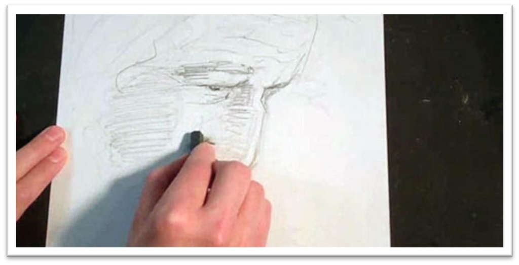
Begin the sketch with a tonal study.
This step will not only give you a chance to familiarize yourself with the features and shadow shapes on the of the face, it will also help you to see the overall effect of the framing, contrasts, and angle of the face.
Start with the head. Make sure that the angle and size is correct, then use light, sketchy lines to place the guidelines for the eyes and nose.
Draw the eyes, nose, and whatever you can see of the mouth, then use some scribbly lines to roughly indicate where the hair is going to fall.
Use a graphite stick to begin darkening the darker lines and adding the shadow shapes that fall on the face and hair.
The tonal study should be loose and messy, but clear enough that it will be a help in making the finished piece.
As you work, consider how you want to approach a finished drawing.
Lay in the hair with a different texture, such as what is created by using the graphite stick on the side, so that the hair will remain distinct from the face.
Blend the skin tones a little with your finger if you want, then go over the top with the most important lines in and shadows that are needed in making his expression.
When you’re confident that the face is finished enough that you have a clear guide for the finished drawing, put the tonal study off to the side and begin work on the final portrait.
Drawing on Tinted Watercolor Paper
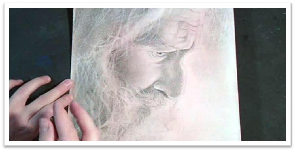
You can draw on watercolor paper or tinted watercolor to change the look of a portrait.
Simply paint a wash of fairly light color on a piece of watercolor paper (make sure to fasten it to a firm support if it’s not gummed to a watercolor block to keep the paper flat), then let it dry completely.
Begin the drawing in the same way as the tonal study, starting with the angle and size of the overall head, then adding the guidelines and developing the features.
Once you’re confident that the lines are correct, clean up the sketchy marks and give yourself crisp, clean lines to work from.
Darken lines that are in the shadow side of the face and start laying in some tone in the eye.
Develop the shadow shapes in the face using smooth, horizonal lines that follow the curvature of the plains.
When the shadow shapes are filled in, blend them with a large chamois cloth or tissue wrapped around your finger.
This will lighten the tone drastically, so you will need to make a second pass of tone in the darkest places.
When you add the second layer of tone in the darkest shadows on the face, blend the tone out smoothly with a tortillon or stomp, which is better for small areas that need to be precise.
Blend in the same way that you put the tone down initially: directional to the contours.
Emphasize lines not only by darkening some, but by erasing some. Because the areas without tone are the lightest areas on the page, they will read as highlights even though they aren’t white.
When the tone on the face is done, pull out a few hairs flying away over the face using the kneaded eraser as a blade.
You can emphasize these lines by darkening one side of the highlight with a sharp pencil.
For the body of the hair, put down some tone by following the direction of the growth of the hair, then smoothing that tone with a tissue. Pull out a few highlight strands with the kneaded eraser, then emphasize small areas with graphite.
Don’t drive yourself crazy: you don’t need to add every hair. You only need enough so that the entire mass will read as hair, and that takes surprisingly little detail.
To make sure you aren’t over-working your portrait, continually step away from the drawing as you work to make sure the detail is adding realism without overwhelming the piece.
Sketching an Outward-looking Portrait
In the second portrait, we’re going to work on the portrait of a child looking at something the viewer can’t see, so the mood shift in the simple change of where the child is looking will be apparent.
In the last class, the old man was looking down, pondering something inward, and the simple fact of looking at him in this private moment felt just a bit intrusive.
By shifting the focus of the person outward, the point of view changes, and with it, the relationship between the person in the portrait and the viewer.
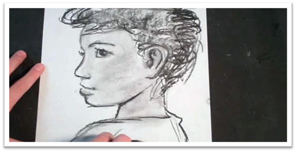
So begin the portrait with a tonal study again, working in the medium of your choice. I’m using willow charcoal in this study, but graphite works just as well.
Quickly sketch the head within the confines of a guideline for the angle and size that you want the head to be at, then place the guidelines for the features.
Remember, the relationship between the features never changes; they just appear to change as the head moves.
No matter where the ear is, the top of the eye should line up with the top of the ear, and so on. When the guidlines are correct, sketch the eyes, nose adn mouth.
Erase the guidelines and clarify the hairline. Already, you can see how the expression and direction of sight modifies the mood of the portrait.
Add a base tone to the skin by loosely filling in a small area on the cheek with willow charcoal, then blend the tone with your finger to wipe it evenly over the surface of the skin.
This will wipe out most of the line quality, so you’ll probably need to go back over the lines of the features to better clarify them.
Add tone to the hair, keeping it distinct from the skin tone by making it darker and/or keeping it a different texture than the skin.
You can begin to add a few lines to show that the hair is curly and to give yourself a map of the hair growth.
If the lighting is dramatic, there will be clear shadow shapes on the face and clothing that can be laid in over the base skin tone.
Even if the lighting is subtle, you can still pick out the shapes and lay them in; just make the contrast between the base tone and the shadow tones less distinct.
Re-darken the darkest places on the face, hair, and clothing, and the tonal study is complete.
Drawing a Finished Outward-looking Portrait
This portrait will be drawn on charcoal paper.
Begin by sketching the angle and size of the head, then begin to carve out the profile to show the nose and mouth more carefully.
The interior guidelines should match up with the outer face, so draw guidelines for the eye, ear, bottom of the nose and the mouth. Fill in the shapes of the features and erase the guidelines.
Clean up the lines of the features, remembering that you’re not trying to emphasize lines, but only show the outer shape of the features.
When the features are correct, use a darker pencil to darken up the eye, nostril, and the line between the lips.
This will give you a little clearer idea of how the face will look when the tone has been added, but it’s not so dark that you can’t make adjustments if needed.
Begin adding a base tone with a medium softness pencil on the side, working wiht smooth back and forth strokes working from top to bottom.
In the shadow shapes, you can press a little harder to make the tone darker. When the face and hair is covered, blend the tone smooth with a tissue. If you got tone in the white or highlight of the eye, erase it out.
Use a tortillon to darken the pupil and iris in the eye. Keep the tone uneven to help give the eye depth, darken the upper line of the lid, the eyelashes, and then add tone to the corners of the white of the eye with the tortillon.
When the eye is done, add detail to the nose in the same pattern: darks first, shadow shapes, blend, take out highlights, and work up the entire feature as one piece.
If you want to darken further, use a charcoal pencil. If the skin tone isn’t dark enough, you can add tone with a charcoal stick.
Create charcoal dust by scraping the stick over a piece of sandpaper, dip your cloth in it, and add a smooth layer anywhere on the portrait that you want to darken.
After darkening the skin tone, you may need to go back over the features to bring them out again.
Use a charcoal pencil to add details to the lips, eyes, and creases in the neck. Then blend the tone in the hair using a chamois cloth, wiping the tone smooth in the direction of the hair growth.
When the hair is smooth, pick out highlights with a kneaded eraser and add flyaway hairs over the forehead and on the outside of the hair.
Don’t add too many hairs; you just need a small detail here and there to bring the realism up to the next level.
Add some seam lines to the shirt, then look for the shapes of the shadows on the cloth and add them with a chamois cloth or tissue dipped in charcoal dust.
You may not want to push the clothing very far. When you feel that the portrait is complete, take a step back and see how it looks from different distances.
You may want to come back in a few days and add any final details or make adjustments at that time.
Sketching an Adult Looking off the Picture Plane
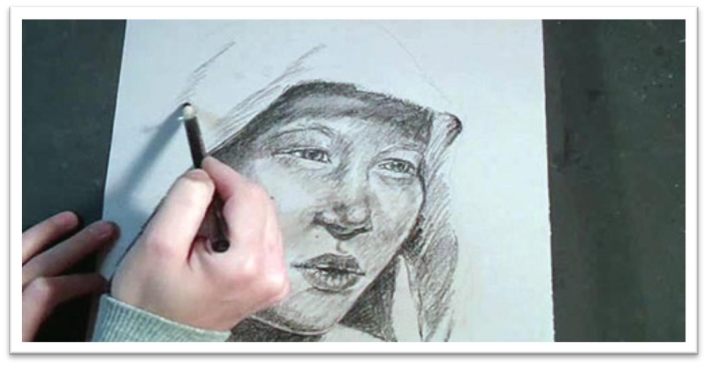
In this portrait, we’ll couple a face looking off in the distance with more dramatic lighting to see how those elements combined impact the mood of the portrait.
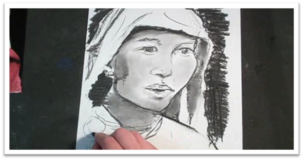
Sketch the tonal study with a piece of willow charcoal, using quick, sketchy lines to establish first how big you want the face to be in the picture plane and at what angle the face is at.
In this portrait, the face is at a slight tilt, so the regular measurements made in terms of eye length won’t work.
In cases like that, you might be farther ahead to eyeball the eye placement, then place the remaining features accordingly.
The rules of proportion in the face still apply, they just can’t be determined as easily in a face- forward view.
When the features are correctly placed, clean up the guidelines and concentrate on the shapes of the shadows.
Remmeber, this is a study in how lighting creates mood, so the shadow shapes are very important.
The edge of her face is defined by a black shadow on the cloth of the headpiece, and the shadows on the face are sharp and dramatic as well.
Lay the shadows on the face as large pieces, then smooth with your finger or tissue to soften the edges.
After blending, you will need to go back over the lines of the face to bring them out again.
When the face is done, add the dark background to get a better sense of how that will affect the portrait.
Give yourself plenty of time to get things the way you want them to be.
Experiment with patterns in the headpiece and dress to develop some interesting contrasts to the smooth dark background, go over lines that aren’t clear enough, clean up shadow lines, and so on.
When the tonal study is complete, you’re ready to move on to the final piece.
Drawing a Portrait with Dramatic lighting
In the finished portrait, we’ll work on tinted charcoal paper.
The surface is more toothy than regular drawing paper, and is appropriate for graphite or charcoal, but try to keep erasing to a minimum to avoid wearing that texture down.
Sketch the face on the paper just as you did in the tonal study, giving yourself little
marks for where you want the shapes to end, and then connecting the lines between those marks to develop first the big shapes, and then the smaller interior shapes.
Give yourself guidelines and sketch the features in place, then erase the guidelines carefully, and sketch in the shapes of the shadows.
Once the facial features are accurately placed, you can start adding the tone.
In this portrait, we’ll change techniques to develop a portrait of cross-hatched tone that maintain a clear line quality rather than blending the tone smooth.
Start by darkening the outer lines of the darkest, most definite features, such as the eye and nose.
When the lines are correct, build up tone by hatching parallel lines in the shadow shapes, then cross-hatching to darken the tone.
Start with a hard to medium hardness charcoal pencil to develop a base tone over the entire face, then upgrade to a softer pencil for the darkest places.
This will give you a nice range of tones and allow you to build up depth. The lines don’t have to follow the contours of the face in this technique, but the hatched lines should follow a consistent angle from one part of the portrait to the next.
Make sure you’re not over-outlining the features; the eye will fill in detail if you just give an indication.
As you build up the tone, you may decide to blend some of the darkest areas to more quickly develop a shadow side of the face, but then you’ll go back over that with more line quality.
When the skin tones are established, use the same technique to lay in the shadows on the hair and head dress.
In this case, the dark shadow of the cloth helps to define the side of the face as well, so the whole portrait flows together.
Use a charcoal stick on the side to quickly build up the tones in the extremely dark background, still using a hatching and cross-hatching technique.
Remember, once you introduce the charcoal stick in the background, you need to bring it into the darkest areas on the face as well, so the new medium doesn’t stick out.
You want the portrait to have unity without.
Sketching a Straight-forward Stare
We’ve looked at the mood portrayed by people looking down and off to the side, now we’re going to draw face-front expressions in which the person makes direct eye contact with the viewer.
In this class we’ll draw a child, and in the last class we’ll do a similar portrait of an adult.
Begin the tonal study with the face on the page.
Make guidelines for the eyes on a line that is the vertical center of the head. To make sure the eyes are the same width and are one eye-length apart, use a piece of scratch paper to act as a ruler.
Place the other features in terms of the eye length. The eyes are usually half an eye-length wide, and the nose is one eye-length down from the bottom of the eye.
The mouth begins half an eye-length below the bottom of the nose, and the chin is about half an eye’s length from the bottom of the mouth.
Sketch the shapes of the features within those guidelines for the general placement, then erase the guidelines and clean up the lines of the features as needed.
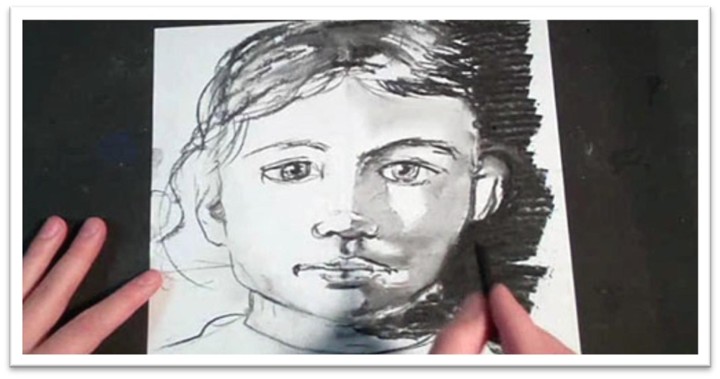
Put down the shadows on the face with dramatic tone using a willow charcoal, seeing the shadows as large pieces that connect.
When the shadows are placed, blend them with your finger to soften and unify the tone to make it read as a flat shadow instead of a dark mask.
You want the patterns of the shadows to be distinct without seeming outlined and artificial.
Don’t do too much finicky detail work on the tonal study, but give enough that you give yourself an accurate representation of what the finished portrait might look like.
Take the opportunity of the tonal study to examine which small changes alter the overall expression, the strengths and weaknesses of the composition, and how best to go about completing a finished portrait.
Think about which surface will be best for the approach you want to take, and try to see how the portrait would look on some of the surfaces we’ve experimented so far: toned watercolor paper, white or off-white drawing paper, tinted charcoal paper, pastel paper, or something else.
Drawing a Straight-forward Stare
The finished portrait will be drawn on tinted matboard, which is a wonderful drawing surface for its wide variety of color and texture options, availability, and smooth, heavy weight.
However, make sure to choose an acid free board that won’t yellow with time if you want the work to last.
Begin the sketch with a 2H pencil, starting with the head shape, then placeing the guidelines.
In a straight-forward looking pose, the eyes are in the horizontal center and the nose falls on the vertical center, and everything can be placed (roughly) in terms of the eye length.
Give yourself boundary lines for the width and length of each feature, then sketch them inside the confines that you’ve established.
Clean up the lines of the features, giving yourself just one line to work from as an outline.
Erase the guidelines as you go, working gently so as not to tear the somewhat delicate top layer of matboard.
As you work, concentrate on making your lines interesting by varying the thickness.
You can begin defining the shadow shape on the face early, since it it so pronounced and will alter the appearance of the features.
Work from one feature to the next, gradually darkening lines and blendind to build up the realism of all of them at the same rate rather than finishing one feature completely and then moving on to the next.
When the line work is finished, start using smooth back and forth strokes to push the shadow shape farther, then blend with a chamois.
Once the chamois has some tone on it, you can use that to build up the light tone in the highlight side of the face.
Use a graphite stick on the edge to start building up the tone in the hair. Because it naturally skips over the surface, each line will have in it the broken appearance of highlights and lowlights of real hair.
Press harder in the shadows, then include the hair in the blending step.
After blending, darken the lines and shadows a second time, concentrating only on areas that need to be punched up to another level.
After the second pass of tone has been put down, use a medium to large stomp to blend the tone.
The stomp will leave a lot more tone on the paper and allow you to keep the tone darker, but it is best used in smaller areas.
Use a kneaded eraser to pull out small details in the eyelid, bottom of the nose, and mouth. These highlights help define the form and add a highter level of realism to the portrait.
Add additional realism to the hair by pulling out small flyaway hairs that cross the body of the hair and brush across the forehead.
Stand back and examine the portrait to see its effect from different distances.
The mood created by the defiant, straight-forward eyes of the little girl is certainly different than that of eyes looking at something other than the viewer.
Consider how the portrait makes you feel and what questions it brings to mind. Ask yourself if this is how you want your viewers to feel when looking at your work, and if you want, try changing the portrait by switching the direction of the eyes.
Sketching a Man’s Straight-Forward Stare
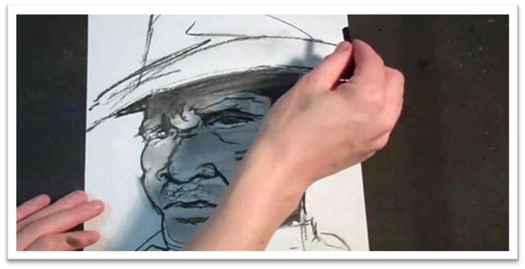
The last portrait combines all of the elements of making a highly dramatic mood in a portrait: a straight-forward, defiant stare that locks eyes with the viewer, a face that fills the picture plane, and intense lighting with strong shadow shapes on the face.
Begin with a few rough strokes on a piece of scratch paper that quickly define the shape and size of the head and hat.
You want the angle of the face to be correct above all. Clean up the outer line of the face to help to place the interior shapes of the features, then give yourself parallel guidelines for the eyes and nose.
When the guidelines are in place you can start placing the features.
Because the head is at a tilt again in this picture, you won’t be able to depend on the usual head-forward dimensions measured in terms of the eye length, so eyeball the shapes and refer to references continually to double-check yourself.
Wipe away unwanted lines (if you’re using willow charcoal, this might mean no more than a touch of a finger) and define the shadow shapes.
When you blend these, you can also build up the base skin tone, which is dark in this case.
After blending, you may need to bring out the facial features again, strenthen lines of the shadow shapes, and blend the darkest tone smooth a second time.
Make enough adjustments to the tonal study that you feel you have a clear guide to work off of for the portrait, and then move on to the final piece.
You don’t want to spend too much time on the tonal study, or you’ll begin to lose momentum for the project and you’ll be discouraged from always doing a tonal study before begining a final piece in the future.
Just use the time to familiarize yourself with the most important elements of the picture and do some troubleshooting; it doesn’t really matter what it looks like as long as it does its job in that respect.
The finished portrait will be drawn on tinted matboard, which is a wonderful drawing surface for its wide variety of color and contrast.
Drawing a Man’s Straight-Forward Stare
For the finished drawing, we’ll be working on pastel paper.
The tooth of pastel paper is similar to charcoal paper, but sketching a solid graphite layer on pastel will look more round, and on charcoal paper the texture is more like mesh.
Use a 2H pencil to quickly get the head, hat, and guidelines for the features in
place.
When everything looks correct, darken the lines with a HB pencil so you can see everything a little better.
The next step is to lay down a foundation base tone of darker tone using a medium charcoal pencil on the side.
When the face is covered, blend the tone smooth with a chamois, then emphasize the shadow shapes with a charcoal pencil at the same time.
Once the base tone and the shadow shapes are in place, you can do more work on the individual features.
Start work in the eyes, darkening the upper lid, the shadows around the upper lines, the pupils, and so on. Even if the detail is unclear in the reference, add it in your drawing.
Add additional tone where needed and re-darken the darkest shadow shapes. The texture of the paper lends a a sort of gritty quality which is especially fitting to this particular portrait.
However, because the tooth is so prominent, you’ll need to do some blending to be able to pick out highlights. For the initial blending, your finger will work well. It won’t fill in all the tooth, but will soften the skin tone.
For the areas that you want to build up as very dark, use a stomp to fill in the tone completely. Use the stomp sparingly, or you’ll fill in all the tooth and the drawing will look flat.
After the tone is blended, you can squash the kneaded eraser into a blade and pull out some individual lines in the hairs and small highlights.
After pulling out a highlight, you may want to use a sharp charcoal pencil to emphasize one side of the highlight. This technique works especially well on individual hairs.
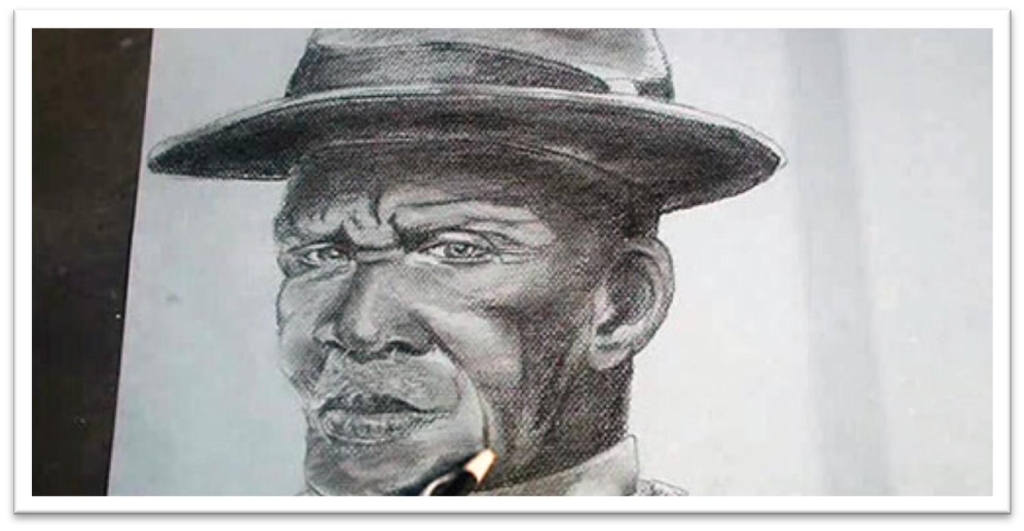
The final result is an intense portrait. The framing, lighting, and defiant, face-forward expression combine to create a definite mood that we haven’t seen in our classes before now.
In your own studio, play with using the same model under different lighting and casting his or her eyes a different direction to really get a feel for how the simple changes transform the mood of a portrait.

