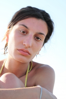
Lifelike Portraits
Class 1: Introduction, Supplies, and Warm-up Exercises
Hello, and welcome to your course on how to add life to your pencil portraits.
This course is designed to have everything needed to launch a beginner in drawing portraits, as well as challenges for the intermediate to advanced artist.
Most of the classes build on each other, so I recommend that you view them in order.
When you’re familiar with the classes, you can re-view as needed to refresh your memory or re-view a certain element of a drawing.
Supplies: All you really need to get started in drawing is a pencil and paper. However, to get the most out of this course, consider purchasing the following:
Three pencils, either charcoal or graphite, in hardnesses 2H, HB, and 4B. Most of your work will be done with those three pencils.
If you want to invest in a wider range, of course that is your choice.
You won’t need a pencil harder than a 3H or softer than a 6B for any of the techniques in this course.
A kneaded eraser (or two or threeß)
Blending stomps (also called blending stumps or tortillons) in a variety of sizes
A blending chamois cloth or a piece of white felt
A sketchbook of drawing paper (for finished drawings I recommend 140# acid free paper)
Inexpensive hand-held pencil sharpeners and a piece of medium sandpaper
Frisket film, tracing paper, and something with a fine tip that won’t tear paper, such as a stylus, bamboo skewer or sharpened dowel
Once you have your supplies gathered, take some time to acquaint yourself with how to hold your pencil to access the tip (a basic writing hold) or the side (the hold you use to put down tone).
These should be very different holds, and if you’re not used to the over-hand hold needed to access the pencil’s side, you need to practice putting down smooth tone, both dark and light, until you are comfortable.
Practice varying the pressure you need to make dark or light lines as well.
Practice blending tone with your chamois or felt by wrapping it around your finger and blending in smooth circle strokes.
Next, practice blending out one side of a line with your stomp or tortillon.
You want to work on minimizing the appearance of lines while keeping a clean edge quality.
Practice mashing the kneaded eraser into a blade and pulling out crisp lines once you have tone down on your page.
Then practice rubbing out small lines, or erasing mistakes.
Make sure to unwrap the whole eraser before you use it—you can’t use it to the best effect if you’re trying to keep one part “clean” by keeping it wrapped.
Class 2: Drawing from Life
Once you know how to manipulate your supplies to best effect, it’s time to start applying those techniques to an actual drawing.
Before you dive into drawing portraits, take some time to work on something a little more simple like, in this class, a plain white coffee cup.
Drawing realistically is all about translating a three-dimensional object to a two dimensional surface, and that means paying close attention to the outer shapes of the object, and the way light strikes the surface and creates patterns of shadow, midtones, and highlights on the surface.
Set up a still life of your simple object, such as a mug, and turn off the lights in the room.
Spotlight the object and examine how the change in directional lighting changes the size and direction of the shadows, both shadows cast on the ground and shadows on the object.
Place the light in a place that makes an eye-pleasing arrangement to draw, then begin your drawing. Start by giving yourself small guides for the size of the object on your page.
You want it to fill the page but not to be too big. When you have the approximate size mapped out, sketch the outer shape. In this case, it’s a simple cylinder with a rounded top and bottom.
When the large shape is sketched, add details such as the handle and the upper and lower rim of the cup.
Erase the sketchy lines and re-draw more accurately, trying to make these polishing lines clear and crisp without making them too dark.
But be careful not to outline the cup.
Examine the object and you’ll see that there aren’t visible lines all the way around the cup; some sides are lost in the light, others are very dark.
You need a variation in your line quality in order to develop realism in your drawings.
Next, begin adding tone. Hold your pencil in the overhand way you need to access the side, and add tone in smooth, even swathes. You want each pass to overlap the last slightly.
Make sure that you follow the contours of the object as you add tone (to clarify, the lines of tone shouldn’t be horizontal, but curving slightly either up or down depending on how the cup is angled).
Blend the tone smooth with the chamois or felt wrapped around your finger.
Use circle strokes that disguise the lines and help make a realistic transition from dark to light.
After the first pass of tone, you may need to go back and re-darken the darkest tones on the cup.
Look for the core of shadow (the darkest part of the shadow, usually visible as a line or cone of black on the object) and add tone to make it as dark as necessary.
Pull out a highlighted edge using your kneaded eraser mashed into a blade.
This is the line of reflected light, and is often visible on the darkest side of the object.
There will also be highlights where the light is striking the cup most strongly, and may be other small highlights in the handle or cup edge.
Examine the object closely and pull out lights as needed, then blend for a final pass with your stomp or tortillon.
Make sure to use the largest blending tool you can for the area to ensure the smoothest pass possible.
Class 3: Draw a Nose
Now that you’ve practiced blending and looking for highlights and shadows on a smooth, regular surface, let’s apply what you’ve learned to the simplest feature of the face: the nose.
Begin by touching your own nose. Feel how the tip sticks out and is like a little ball, while the bridge of the nose is bony and stands off the face from the ball clear up to where it attaches to your head between your eyes.
The angle is quite steep from the bridge down either side of the face to where the eyes are situated, and that means you should expect to see both some heavy shadows and some bright highlights on those parts that are most likely to catch the light.
The nose is easy to draw.
There is the tip, the bridge, the nostrils, and the septum, which lies between the nostrils.
Begin with the ball and build up the bridge as two vertical lines that make a column, then add the swoops of nostrils and you’re done with the external lines.
Depending on how the face is being held, you may or may not see the two dark shapes of the nostrils, but in any case, you should see shading on one side of the tip and bridge that show how the nose is on a higher plane than the rest of the face.
When you have the external shape of the nose drawn, clean up your lines and draw them again more carefully, making sure not to use a heavy line that outlines the form.
You should see a definite variation in line quality—on the lighter side of the nose especially, there is often only an extremely subtle hint of a line defining the nostril and tip.
Add tone to the nose as a base for the skin color and blend smooth. Depending on the size of the nose, you may be able to do the initial blending pass with your chamois, or you may have to use a large stomp from the very beginning.
Pull out highlights on the tip, the bridge, and the highest points of the nostrils as needed.
Add additional tone to the darkest places if necessary. If the underside of the nostrils are visible, they will be very dark; the nostrils and pupils are the two black spots on the face.
Don’t forget that line of reflected light on the edges of the wings of the nostrils. Those finishing touches will really do a lot to lift the features and add greater realism to your portraits.
If you finish one nose and are proud of it, try again in a different position.
Every nose is different, and the more practice you have drawing different noses the better artist you will be.
The nose is also the feature that changes the most as a person grows, so be aware of that and be observant of the face that you’re drawing.
Babies have no bridge on their nose, and if you develop shadows beside the eyes and in the nose too much, you’ll add unintended years to your drawing.
Class 4: Drawing Eyes
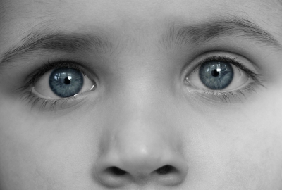
Now we’re going to switch from drawing the easiest feature of the face to the most difficult: the eyes.
The eyes are hard to draw well, not only because they have a wet surface that catches the light and a myriad of interesting shapes in the iris, but because the brunt of the expression comes through the eyes.
The placement and size of the pupils, the roundness of the iris, the whites that are showing…these are all crucial elements in making the expression you intend.
You have to work carefully in the eyes, and give yourself time to build them up in slow layers that allow for alterations before you get too invested in any particular line or tone.
Begin with the approximate shape of one eye. Measure the eye length and place the second eye one eye’s length apart from the first.
Sketch the second eye to be the same shape and size as the first.
Clean up the lines and re-draw them as needed to make clear, crisp shapes that don’t look overly outlined.
This is harder than it sounds. You will need to use varying line thickness, and remember that you don’t need to draw a solid line for the viewer to interpret a solid line; just a hint of a line is enough.
Add the smaller shapes of the eye: the upper and lower lid (NOT the eyelashes yet), the iris, or, colored part of the eye, and the pupil.
Draw the highlight in this early stage as well so that you can avoid getting tone on it from the beginning.
When all the shapes are correct, your eyes should look well-balanced, centered on the head, and similarly sized in height and width.
If all of that is good, you can start adding tone in the iris. Begin with some lines that almost look like daisy petals running around the center pupil.
You can see these best if you examine your own eye in the mirror.
The outer edge of the iris is also usually much darker than the rest of it. Darken that edge a bit, but don’t make it as dark as it will be at the very end.
Add some tone to the pupil and to the skin around the eye as well.
Blend with a stomp. Use the largest size you can for the area; this may mean downsizing when you come to the pupil and outer edge.
Remember the lessons you learned from shading the cup in the beginning of the course: there needs to be some shadow in the corners of the eyes to make it look like they are lidded balls curving back in the face.
Strengthen the darkest areas with additional tone after blending. You’ll usually see a heavy line in the upper lid as it folds to reveal the open eye.
The pupils and parts of the iris will also need additional tone, and if you smudged some tone over the highlight, make sure to clean that out before you push forward.
When the skin around the eye is blended smooth, then add your eyelashes. Before you do, examine your own eye in the mirror.
The lashes on the lower lid are much shorter, sparser, and less dark than the upper lashes, and usually are only visible in the outer half of the eye lid.
Make each eyelash with one quick stroke, working from the base of the lid out so that each hair follows the natural direction of growth. Err on the side of too few rather than too many.

Class 5: Accuracy Through Graphs and Guidelines
This class will answer my most frequently asked question: How do you make your picture look like the photograph?
The answer is through a carefully planned set of external graphs and internal guidelines. Nothing is guessed at in realistic portrait drawing; there is much more measuring, checking, and re-checking than estimation. It’s really quite technical.
And the more detail-intense the drawing, the more technical the initial layout.
Begin by cropping your reference photo to the exact dimensions you want it to be to make an eye-pleasing composition. Surround it with a paper frame so that you can make marks on the outside of the photo.
Measure the length and width and write that down as a simple equation that you will use to make a precisely proportional frame on your drawing paper.
For example, if my original reference photo is 4” wide by 6” tall and I know I want the new width to be 9” on my drawing paper, I can cross-multiply to find out what the proportional side would have to be (4/6= 9/x).
The new length would have to be 13.5”. I would then draw a rectangle 9 inches wide and 13.5 inches long on my drawing paper.
Measure the reference material to find the center of each side as well as eight or more divisions.
Do that around all four sides. You don’t have to have the same number of increments for the height and width, but you do have to keep it consistent between the reference and the drawing paper.
Label the increments for the width numerically (1,2,3…) and the increments for the length alphabetically (A,B,C…).
Now measure your drawing frame and make the SAME number of increments for height and width that you have on your reference material, then label them the same way.
You now have a quick and easy way of seeing where things are on the reference and putting them down in the same place on your drawing paper.
So, for instance, you may find that the top of the head lines up on point D,2. Simply find point D,2 on your drawing paper and make a dot.
Find the bottom and sides of the head the same way, and then you can start to play connect the dots. By using the graph, you can place your large shapes very quickly and with great confidence.
The graph doesn’t work as well for placing smaller details like the eyes and nose, etc, because the smaller your shapes become, the more accuracy matters.
It’s not good enough to say “it’s about on B6” when you need to know exact placement for small shapes. So then, use guidelines that you take from the reference material.
If the head is straight, the eyes are right in the center horizontally and the nose is centered vertically. Make a “T” on your drawing to develop guidelines for the eyes and nose.
Next, measure how the features fall on the reference in terms of eye length (EL).
The eyes are one (EL) apart, there is one EL between the bottom of the eye and bottom of the nose, one EL from the bottom of the nose to the bottom of the lip, and about half an EL from the bottom of the lip to the bottom of the chin.
Refer to your reference to get exact measurements in terms of EL for the face you’re drawing. Once you know where everything goes, then it’s simply a matter of taking the time to draw the features accurately.
Difficult to be sure, but it’s a lot easier to draw the nose when you have guidelines for how wide it should be, how low it should go and where it should lie on the face than if you’re guessing at placement as well as shape.
Class 6: Contrast and Light
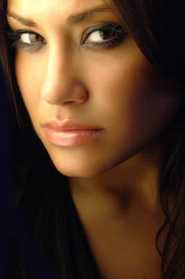
One of the most important elements of lifelike portraits is the use of light and contrast. Contrast is the difference between the lightness or darkness of two tones.
The farther apart they are on the value scale, the higher the contrast is.
You can build strong contrasts in your drawings by keeping some bright highlights and making other areas very dark. To learn how to do this, we’re going to start with a portrait that has only three values and needs very little shading.
This portrait will help you to look for the shadow shapes on your form.
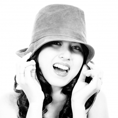
Start with an external grid around your reference photo and a proportional frame on your drawing paper. Then, find the outer boundaries of the largest shapes—the top of the head (or hat, in this case), the side of the face, bottom of the chin, and so on.
Connect the dots of these parameters to start building your large forms. Clean up sketchy lines and re-draw them more cleanly, but remember, you’re not outlining the form. You need edge quality, but that doesn’t necessarily entail lines—edges can be white, or practically invisible.
Build guidelines for the eyes and nose on the head. Measure the eye-length on your reference photo and use that measurement to find where the other features fall.
The eyes are generally one eye-length apart, but if the head is turned, the eyes will appear to be closer than that. Measure the placement for eyes, nose, and mouth every time.
Don’t just guess. When you have guide boxes sketched for the features, start to sketch them in. Take your time. Overall, most of the time you spend drawing your portrait should be in this step. You never want to push forward until all of the features look exactly right.
When you’re sure that everything looks right and the face is recognizable as the person in your photo, start adding tone.
Because there is such high contrast in this piece, the skin appears as white as your paper, so you don’t need to worry about a base skin tone.
The hat is gray, so begin by adding smooth tone with the side of your pencil there, working in the same direction of the curve of the hat. Blend that smooth with a chamois cloth wrapped around your finger if possible, or a large stomp or tortillon.
Add tone to the hair, working in the direction of the hair growth. There will be some places where the hair is one solid tone, areas of highlight, and some individual hairs sticking off. After adding tone, blend it with your stomp.
Add tone to the shadow shapes on the face and clothes, but don’t go too dark. Keep them light enough to make changes if needed. In this piece, there is one large, very apparent shadow that falls over the eyes, nose, hair, and chin in one big piece. Draw it and shade it as one big piece, and remember to look for shadows like that in all your future drawings as well.
Shadows don’t stop at the edges of features; they fall across the entire form as a whole.
Blend the shadows on the face with a stomp, and if they look correct at the end of this stage, add additional tone. This time, don’t be afraid to make them very black and solid, just as they appear in the photo reference.
Blending a second time will fill that tone in even more. Shadows in the clothes are much lighter. You can wipe them in quickly with a used chamois cloth, then pick out highlight edges with your kneaded eraser to finish.
Class 7: Drawing a Portrait with Light Tones
In this class we’re going to push up blending techniques to the next level, but still keep it basic.
This time we’ll need to develop a base skin tone, so there will be more blending required than in the high contrast piece, but the overall tones in both the skin and the towel on the baby’s head are very light and can be rendered quickly, so the portrait will go fast.
Begin with the grid around your reference photo and the proportional frame on your drawing paper.
This is especially important when drawing babies. If you don’t take careful measurements, you will tend to make the eyes too large and the mouth too big.
Remember too, babies have no bridge on their nose, and their eyes are often more than an eye’s width apart.
Use your grid to find the points of the external boundaries of the head and shoulders. Start with a dot on your drawing paper at the highest point of the head, the chin, and the sides of the face.
Add even more than that if you need to, but when you have enough, sketch the shape of the head and shoulders within those boundaries.
Make sure that your shape touches the guide points that you found using the graph!
When the head and shoulders are the right size and shape, build the guidelines for the features.
Start with the “T” guidelines for the eyes and nose, then make careful measurements on the photo reference using eye-length as the standard for placing the rest of the features.
Box in the boundaries for each feature on your drawing paper, so that you know how big each feature will be and where it will go before you start actually drawing it.
When every feature has its place, draw them, referring to the reference photo to get the shapes very accurate. Don’t move forward until this step is finished. The baby should be recognizable by the end of this step.
Now, add a base tone in the skin. Do that by covering all of the skin, face and shoulders, with an even pass of tone. I’m using charcoal pencils on the video, so my base tone appears very dark.
If you’re using graphite pencils, do this step with your 2H pencil.
Fill in all the tone as smoothly as possible, following the contours of the form, but staying in one consistent direction across everything.
Blend all that tone with the chamois wrapped around your finger. It will lighten considerably.
Then, use a sharp pencil to carefully pick out the lines that are now too light to see. You’re not outlining, just strengthening an edge here and there.
Blend out one side of the lines you just drew by using circle strokes with your stomp. You want a clear edge, but not a visible line.
Add additional tone in the darkest parts of the face and body, such as the eyes, nose, open mouth, and lines by the arms.
Blend with a stomp and pick out highlights with your kneaded eraser. Next, chop the blended tone around the face with the kneaded eraser to create the texture of the towel.
Reinforce that edge with some pencil marks here and there to finish out.

Class 8: Portraits with Dark Tones
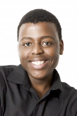
Let’s follow those steps again, but this time draw a portrait with dark tones. You’ll see that the process is the same as in the last class, but blending smooth dark tones presents a unique challenge.
You have to work hard to put that initial tone down smoothly and without visible lines, or it will be very difficult to blend into a realistic skin tone.
You may need to do that blending stage of the skin tone twice, layering additional tone on top of the first pass of smooth tone in order to get the base dark enough.
Begin with the grids around your reference and proportional frame on your drawing paper, then mark off the external boundaries of the head and shoulders.
You need at least four marks for the head (top, bottom, and sides), but feel free to add as many as you want.
Just make sure that every mark is carefully measured using the graph before you put it down.
Connect the dots to sketch in the large shapes of the head and shoulders, then refine those lines as needed by erasing and re-drawing them more accurately.
Don’t draw your lines too dark; keep them light enough to erase cleanly.
Draw guidelines for the eyes and nose, then measure the features on the reference photo using the eye length.
Never guess at the placement of your features, because every face is different. Transfer the eye-length measurements to your drawing paper to make guide boxes for the eyes, nose, and mouth.
Sketch the features in those guide boxes and erase your guidelines.
Re-work the features as needed to make them look absolutely correct, and make sure you don’t push forward to the next step until the face is recognizable.
You may need to give your eyes a break a few times. Leave the drawing for awhile, then come back to it with fresh eyes to see if your lines still look correct.
When the features are right, add the base tone to the skin. Use the same process you used in the baby, but keep your tones a bit darker.
Don’t press harder, just use a softer pencil—3B or so. Put the tone down in one consistent direction across all the face. In the hair, use a charcoal pencil and put the tone down in loose circle strokes.
Blend the skin with your chamois. If it’s dark enough to pass for the mid-tone of the skin, you can re-develop the features on top.
If it’s too light, you need to repeat the last step and add another pass of tone. You can also add a base tone for the shirt color the same way.
Add shadow shapes to the face and blend with a large stomp.
Remember that shadow shapes encompass several features—put them down as large shapes, don’t put the shadows on each feature separately or you’ll break the face into pieces.
Add final line work and tone to the skin and shirt as needed and pull out highlights with the kneaded eraser.
Remember, when you’re working with dark tones, you need to plan for the highlights from the beginning and avoid those areas, or you’ll never be able to pull out a clean bright.
To lighten large areas, blot with a rounded edge on the kneaded eraser. Otherwise, slice out lines with the eraser mashed into a blade.
Class 9: Preserving Perfect Lines and Details
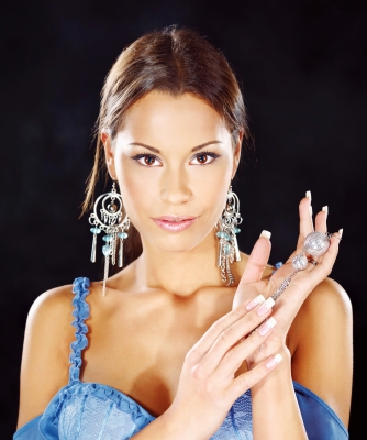
This class will show you how to develop stark black backgrounds with high-detail portraits.
To do these techniques, you’ll need a few additional materials: frisket film, tracing paper, masking tape and/or edging tape (thin blue tape available on art supply websites that is made for masking curves), and a stylus.
You can use anything that is pointed but not too sharp; a bamboo skewer like what you use to make shish kabobs will be great.
Begin by drawing the portrait using the external grid for the large shapes and the eye length for the internal shapes of the features.
This the same process that you’ve used in classes 6, 7 and 8, so you should be very comfortable with it by now.
Next, cover your portrait with tracing paper. The best way to keep small lines perfectly white is by never drawing them at all, but indenting them.
Use your skewer or stylus and scratch in the highlight hairs around the outside of the head and in the body of the hair.
Do be cautious, however; indented lines can’t be erased and are very difficult to fill in, so take your time and don’t make mistakes.
Draw the lines to indent on your tracing paper first, then indent over the top of them.
There are some very small lines in the earrings that can also be drawn on the tracing paper and then indented.
For the large hoops of the earrings, however, you need to use a circle template to draw the shapes on your tracing paper, making your lines very dark.
Then, trace them a second time, still using the template, onto a piece of frisket film. Cut the shape out with a sharp pair of scissors or an Exacto blade, peel off the paper backing and stick the shape in place on the drawing.
Repeat the process to protect the other earring, and use frisket film alone to protect the fingers that are sticking up against the background.
To protect the clean white edge of the shoulder, use the thin blue edging tape or cut a thin strip of masking tape.
If you have to use masking tape, stick it to your clothes a few times to make it less sticky, or it might tear the paper.
Take your time to tamp the tape down carefully, and be very picky. That edge is going to be very high contrast and any flaw will be magnified.
Finally, use masking tape to protect the four borders of the drawing frame, and you’re ready to lay in the black background.
Use a soft, charcoal pencil for this step and press down fairly hard, working in smooth lines or circle strokes, whatever you need to do to keep the tone uniform. When the tone is down, blend with a large stomp.
To make it absolutely black, I even rubbed my finger over everything to fill the tooth in completely. Then, spray the background with a fixative to keep down the smearing.
Use infinite care to remove the frisket from the earrings and fingers. A razor blade might be called for to lift one edge.
Then you can fill in the tone on the hair and face, blend and re-develop lines for the features in the same way you’ve done in the previous classes.
Blend and add skin tone around the frisket film to completion before removing the frisket so you don’t have to go back into anything and risk ruining those clean lines.
Add detail to the bauble in her hand and the clothing, then finish by removing the tape borders.
Class 10: Emotion
Your last class in this course will touch on how to make portraits that are not only technically correct, but go one step beyond and convey a real person that the viewer can connect with.
In order to achieve this, you need to take a lot of time and study emotion. How do the features change when we are feeling sad, or thoughtful or angry?
How do you draw laughing eyes or a crying mouth? In short, how do you make your portraits look like people, and not just well-drawn mannequins?
The first step is observation.
Watch faces as you talk to people, or when they talk to each other. Pay attention to everything—not just the features of the face, but how the head, shoulders, and body moves.
When you feel sad, you don’t just have a downturned mouth; a sad person holds his or her head and shoulders differently than a happy person, or an embarrassed person, or an angry person.
Everything works together to convey an emotion.
So now, practice drawing some actors showing different emotions. In this class we’ll focus on three: worry, anger, and sadness.
Start each drawing with the tilt of the head (that “T” of guidelines for the nose and eyes), then build the shape of the head around it.
Head tilt is hugely important, though, so get it down first.
When the head and shoulders are correct, place the features, but don’t start drawing anything until you have guide boxes placed on the face for the eyes, nose and mouth.
Take the measurements for those guide boxes off the reference photo. Once you know where everything goes, it’s much easier to draw the features correctly.
Realistic feelings are often subtle because people hide their emotions.
The eyes may say one thing, but the mouth another. Always believe the eyes. The viewer is going to look there for the truth of how the person is feeling, so show the feeling there first.
Every line is important, but the crucial elements to keep in mind are the angle of the upper eyelid, the placement of the iris, and the eyebrow.
The muscles that control the eyelids are attached to the eyebrows, so the eyes and brows have to match. Always.
If you’re not sure if the face you’ve drawn is correct, try making the expression yourself in the mirror.
The mouth is also very important to showing emotion.
The line between the two lips and the muscles beside the mouth (seen as lines and subtle shadows) will show the viewer if the person is pursing his or her lips, holding it taut, laughing, or holding back tears.
Many expressions look very similar to each other in terms of any one particular feature, but keep in mind that it is how those features work together along with the tilt of the head and shoulders that conveys how the person is feeling.
It’s not enough to draw a furrowed brow and expect your portrait to look angry. Emotion is a matter of close observation and command over your materials.
Once you know how to blend tones, pull out highlights, keep a razor-sharp line of contrast that doesn’t look drawn, then you can move past the technical elements of drawing and focus on the subtleties of expressing emotion.


