Photo Realistic Portrait
Seeing Positive and Negative Shapes Part I
In this set of twenty classes, you will acquire, step-by-step, the skills necessary to paint and draw photorealistic portraits.
The classes will begin with very easy lessons, focusing on one skill that will be fairly simple to master, and then those skills will build on each other, growing more and more complex until the last four lessons, which are painting and drawing four finished portraits using everything you’ve learned.
Because of the way the course is set up, you need to not only complete every class in order, but repeat lessons until you’re completely satisfied that you have the skill down before you move on to the next class.
Otherwise, you’ll soon be over your head and the course will become frustrating. I cannot emphasize enough the importance of doing every lesson, even if it focuses on a skill that you feel you have already mastered.
If that is the case, then the class will still serve as a warm-up for more advanced classes, and you will not have wasted your time.
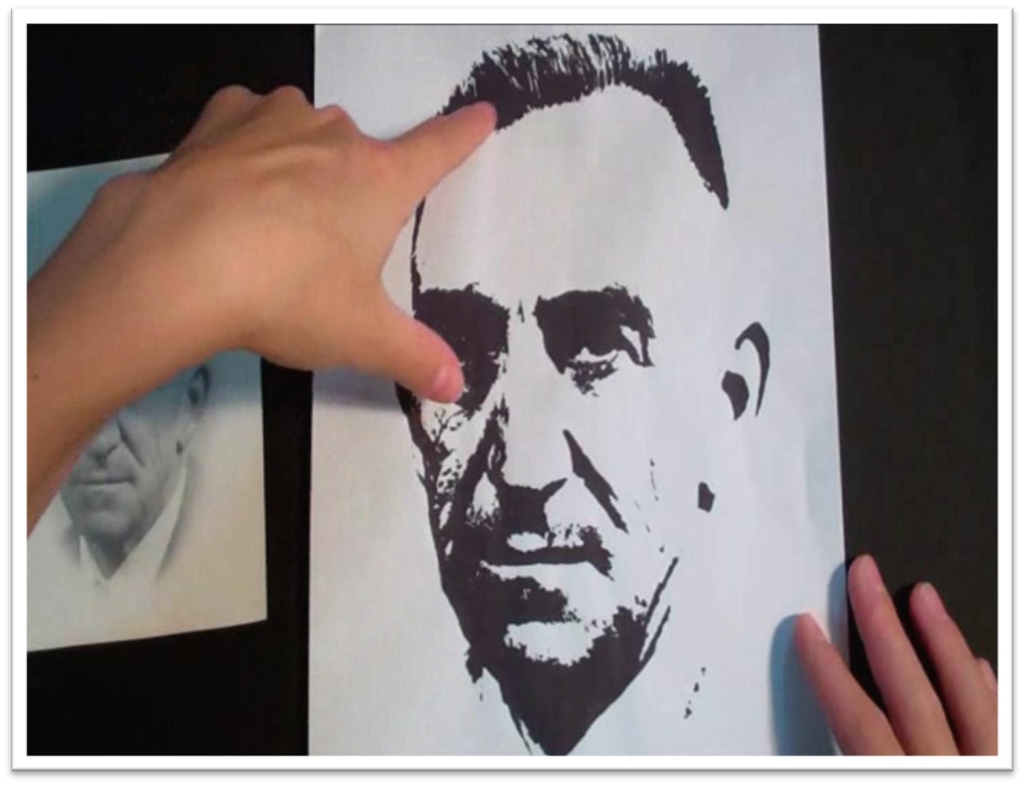
So begin with the most basic skill: seeing positive and negative shapes. You can use any photo that has been sufficiently altered for this excercise, including the one that I use in the film, which is provided for you.
To alter a different photo, simply scan it to your computer and use the photo-editing software of your choosing to increase the threshhold of the gray tones until nothing is left but the largest shadow shapes in stark black and white. Enlarge this photo to the size that you want the finished work to be, then print out a copy.
Trace the image carefully onto watercolor paper using a window or light box, and don’t forget to mark the borders.
The edges of your painting or drawing are every bit as important as the rest of it; they must be planned before you start working.
Tape the watercolor paper to a sturdy support (I use a piece of plywood, but you can use anything), placing the tape to preserve the borders. When the paper is taped down, you’re ready to begin painting.
Indigo, Payne’s Gray, or black are all suitable options for paint. Squeeze out a large blob and spritz it with water to keep it from drying out, then use a flat brush that is just slightly damp and start painting the black shapes.
You will be working slowly with the edge of the brush to develop the high-detail areas, and then faster to lay in the large blocks of tone.
Only switch to a small round brush for the very smallest shapes in the eye. Most of the painting needs to be done with the flat brush.
Remember too that the more water you add to the paint, the lighter and more washed out the tone will become. Don’t be afraid of using paint!
You’re never going to get the blacks black enough if you skimp on the paint, and in this exercise, you’re not only working to preserve the exact shapes that you see, but also to keep the values of your painting consistent with the photo reference.
Take your time and make EVERY SHAPE important. If you do it well, you will wind up with a finished piece that is an exact replicate of your photo reference.
You will also have acquired skills in painting at different speeds, how to hold your brush to make different shapes, how to preserve whites, and the importance of beginning with a drawing that is exactly what you want to paint.
Seeing Positive and Negative Shapes Part II
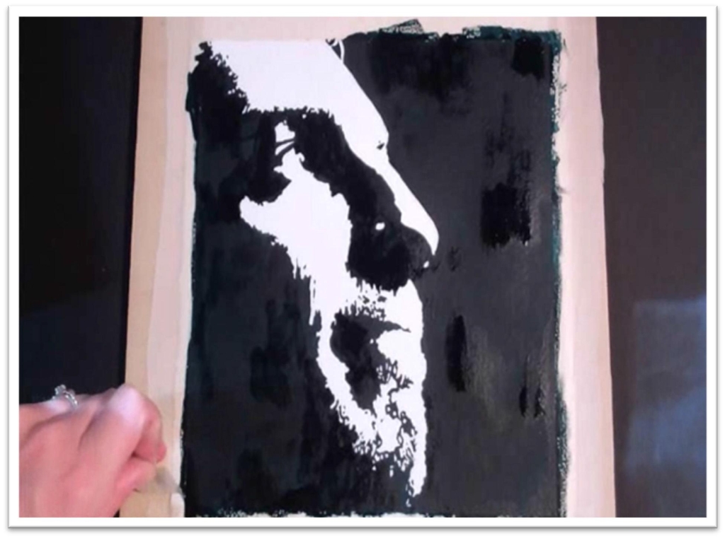
This lesson covers similar skills as lesson one, but now you’ll be working on a background as well as positive shapes on the face, and the colors have been inverted so that the white shapes are positive and black is negative.
This additional training will strengthen your ability to perceive shadows as shapes in their own right, and to develop strong, large shapes not only by painting them directly, but by painting around them.
Begin the same way as before, by choosing reference material with a dark background and editing the photo so that you can only see stark black and white shapes.
Print the reference material out to the size that you want the finished piece to be, and trace the lines on your watercolor paper.
Make sure to mark off your borders, just as before. When the lines are traced, tape the paper to a sturdy support and protect the borders.
You’re still painting in solid black, so make sure you have a good sized blob squeezed out.
Keep the paint moist with a spritz of water, then use a large flat to lay in the black background.
Work left to right if you’re right handed, and the opposite if you’re left-handed to avoid having to stop mid-way to let the paint dry.
Once again, you’ll be using multiple speeds, moving quickly to cover large areas of solid black, then slowing down dramatically to paint the details. Be especially careful when you come to the line that defines the outer shape of the face.
For the small details on the face itself, use the edge of the flat whenever possible, moving to a small round only when absolutely necessary. The round brush will never deliver as smooth a finish as a flat, which is why you should use it sparingly.
Let the paint dry completely, then touch up the black where necessary to make a solid tone without speckles or thin patches.
When you’re satisfied, peel up the tape. This will clean up the painting immediately and show you how it would look framed, as the white margin acts as a sort of mat.
If you’ve done your work carefully, the portrait should be an exact replicate of the reference material. You may be surprised by how difficult this seemingly simple exercise is.
Laying down smooth, solid tone is harder than it seems, especially when you have to account for small details as well as large areas.
If you were at all dissatisfied with your results, repeat the process a second time or more, using either the same picture for reference or switching to a different one. It will be time well- spent: this lesson trains both the hand and eye and prepares you for more difficult skills to come.
Painting Multiple Values
Now we’re going to make it a little trickier.
You’re painting another portrait in this class, still dealing with stark contrast, clear lines that aren’t blended, but now you’ll be adding two shades of gray.
That means that you’ll have to trace not only black and white shapes, but the different gray shapes as well.
This will teach you how to divide multiple values into their largest shapes and will give you more practice in laying down large blocks of color smoothly.
Begin with a reference photo the same size that you want the finished piece to be. You’ll have to put more time and effort into making the tracing correct, because in places where the black shapes are juxtaposed against the darkest grey values, you may not be able to see the differentiation just by tracing alone. In those cases, trace the shapes that you can see, then put in the final lines freehand, looking closely at the reference as you work.
When the tracing is complete, fasten the watercolor paper to a stiff backing and tape off the borders.
Now you’re ready to start painting. It will help you not to get lost in the painting if you begin with the black shapes.
Once you get those in place, you’ll have more context for the grays. After the black has dried, start painting the darkest gray tone.
You’ll be painting dark to light. To make sure that you match that value exactly, use a small square viewing box of watercolor paper as a test strip (a piece of scratch paper will also work).
Keep in mind that the color will dry a shade or two lighter. Mix up enough of the color to cover everything without having to stop mid-way in the painting, and then begin quickly and accurately filling in the shapes of the darkest gray using a flat brush on the side.
You may find it helpful to do the detailed edge of the shape first, and then fill in the larger areas. Be very careful not to cover your small, lighter-colored shapes as you work.
You can either work around them, or protect them with masking fluid.
When the darkest value is completely dry, move to the lighter shade of gray. Once again, be sure to match the value before you start painting, and make sure you have plenty of the color mixed up before you begin.
After painting the greys, you may find that you need to touch up one of the other colors. If that is the case, let the whole shape dry, and then re-apply the color over the top.
You can’t just fix the problem area, or the color will “bloom” where the dry and wet paint touch. If you aren’t satisfied with your painting, do it again until you feel comfortable moving forward.
Take your time, and do the best job you can, and your finished result will look just like the photo.
Pulling a Wash in Watercolor
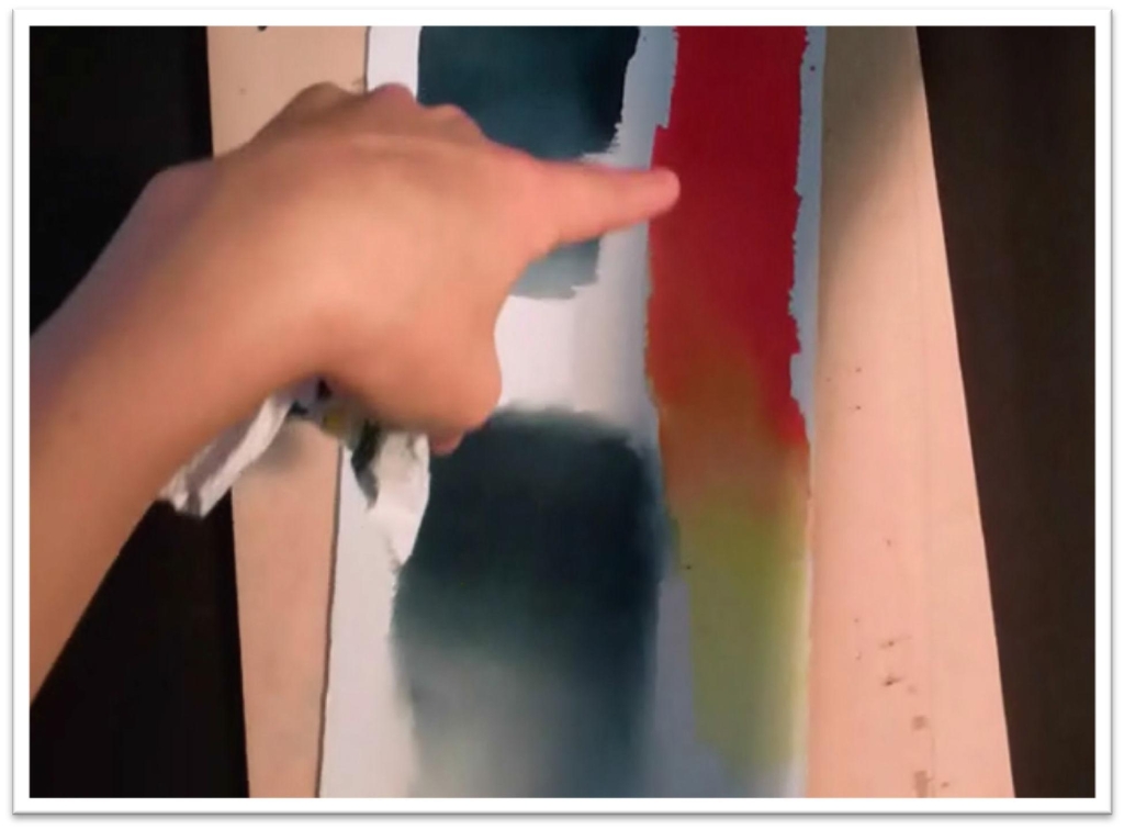
Blending tones in watercolor is called pulling a wash, and it is much more difficult than it might seem.
Even if you’re experienced in watercolor painting, I recommend practicing this technique at least five to ten times on scratch paper before trying to apply it to a finished painting.
Start at the top of the paper with the darkest tone, then gradually lighten the color as you work your way down by blotting more and more paint out of the brush with each pass.
When the color gets too dry, you can add a little bit of water, but be careful not to add too much, or you’ll create a bloom.
You can also follow that same procedure on wet paper, which will give you a very different look, or by using two or more colors to mix a gradient on the page.
When combining colors, make sure to clean the brush before you re-touch the paintbrush to the lighter color, or you’ll wind up making an ugly streak in the paint.
You also need to practice blending lines in graphite before venturing farther in the course, so give yourself time for that as well. Begin by using a small piece of drawing paper and making a heavy mark with a soft pencil; 4B or more.
Practice smoothing out one side of the line, using either a piece of felt folded in half, a tortillon or stomp, or a chamois cloth.
You can blend using small circle strokes, or by wiping the blender across the graphite. Make sure to pick up the blender after each pass, so you’re not scribbling, which will ruin your smooth finish.
Apply the blending techniques by shading a simple sphere. First, draw a circle and mark an arrow so you always keep in mind the direction of the lighting. Next, lay down smooth lines of graphite using the pencil on the side.
Layer your strokes to keep a slight overlap, working from dark to light, and make sure to follow the contours of the object as you work.
The sphere is supposed to appear to be bulging out, so the lines of shading should bulge out similarly.
After placing the lines of smooth tone, blend that tone with the largest blending tool for the area.
Different tools will give you varying results, and before you try a finished portrait, you need a very clear idea of how your materials will behave together, so give yourself plenty of time for experimentation.
You should also give yourself practice lightening and lifting out tone with your kneaded eraser. On the shpere, try pulling out a sharp highlight, lifting out a thin line of reflected light on the shadow side, and lightening a patch around the highlight by blotting.
When you’re comfortable with blending tones in both watercolor and graphite, you can move on to the next class.
Painting a Black and White Portrait with Blended Tones
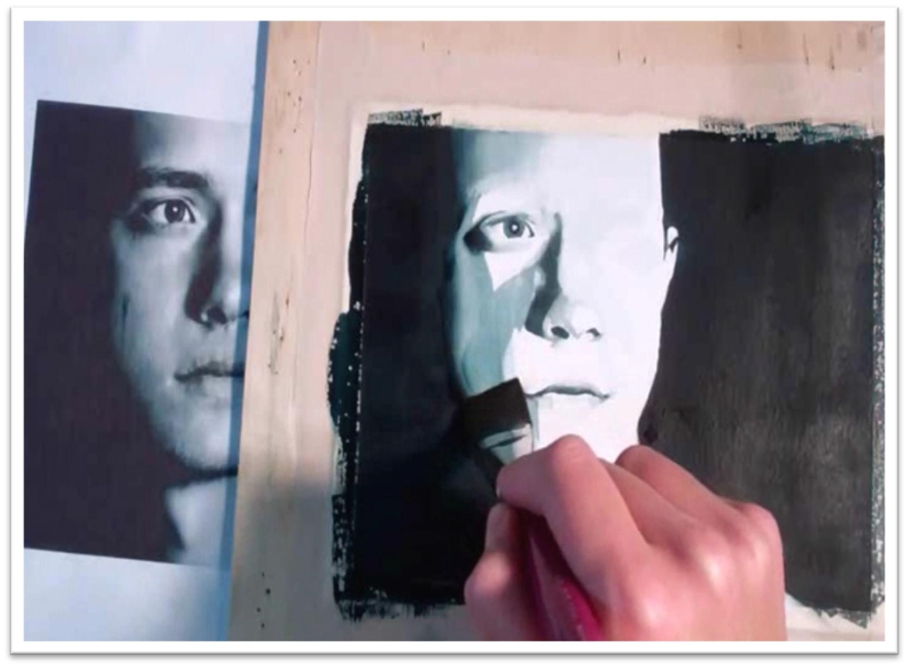
This portrait will involve shading as practice for making gradient tones in black and white as you just learned in the last class.
Don’t worry about drawing the portrait; just trace it as before, tape it down to the stiff surface, and tape off the borders.
Use careful, slow strokes in the background.
Start with the pure black of the background, going fast in the large areas and slowing down beside the face.
When you move to the side of the face that has blended tone, put down the shape of solid black first, then use a slightly damp brush and, while the paint is still wet, dampen the side that you want to have a gradient.
You’re inviting the paint to creep out a bit, which will give you a nice, natural gradient wash that looks very realistic.
Your brush has to have just the right amount of water in it for this to work, and the only way to know is by trial and error and LOTS of practice. No one gets it right the first time, so go easy on yourself if you keep making mistakes.
Check your tones against the reference material using two punch squares. These are squares of watercolor or drawing paper with a one-inch square cut out of the center.
You can save yourself a lot of time if you invest in a one-inch square punch; otherwise, you’ll have to make a bunch of them by hand before you start painting.
They’re truly indespensible. If you need to darken up tones or adjust your shapes, wait until the paint is dry and then make those adjustments, following the same procedure.
Downgrade to a smaller flat brush to begin work in the gradients on the face itself, but follow the same basic method: begin with the black core, painting that in as one continuous shape.
Soften the edges with a damp brush, inviting the paint to bleed out and create a natural-looking gradient, and check your tones and shapes against the reference material. Take your time and carefully follow this same procedure over the rest of the face.
For shadow areas that don’t have a black core, make sure to match your tone against a swatch BEFORE you paint it on the face.
Your highest priorities are matching the shapes and tones to the references, so checking your tones will ensure that you don’t ruin the painting by making the tones too dark, or waste time by making them too light.
When you’ve painted everything, let the paint dry and then compare, square by square, your finished painting to the reference using two punch cards.
Don’t move forward until you’re comfortable painting a black and white portrait, or adding color will become too frustrating. If you need to start over, don’t view that as a failure, but as a time for you to hone your skills.
Remember, you’re trying to polish your individual skills as an artist, and everyone starts at a different level. You haven’t failed if you don’t get it right the first time.
Drawing a Black and White Portrait with Blended Tones
In this class, you’ll be drawing in graphite the same portrait that you just finished painting.
This way you’ll already be familiar with the shapes and lines and it won’t be such a jump working from one medium to the other.
Any photo reference with stark contrasts and some blended areas will work, so use whatever you like.
I do recommend that you keep it small at this stage, though, and the simpler it is, the better. Trace the lines and tape the paper’s borders, then get started on the background.
Work from left to right (if you’re right-handed) so you don’t smear the graphite as you work across the paper.
Get a very soft graphite pencil, 9B or so, and layer the tone in the background by using the pencil on the side and laying down one stroke over the next until the area is filled.
You’re trying for a nice, smooth finish. When you’re done going one direction, cross-hatch the lines to go the opposite direction, then a third, and even fourth direction.
Make sure that you’re filling the tone clear to the taped edge, and be aware of the surface you’re drawing on. If you’re working on wood, you need to pad the surface with paper before you begin so you don’t pick up that wood grain texture.
When the background is as dark as you need it to be, begin building up the tones in the face.
Use a medium soft pencil to lay in the base skin tone (HB or so), then blend that with a chamois. After blending the first time, use a softer pencil (3B or so) to develop the darker shadow shapes.
Just as in painting, put down the dark core of shadow first, then use a stomp or tortillon to gently blend out those edges.
When the skin is done, work with a very sharp pencil to develop the features. Use a sandpaper block to sharpen just the tip of the pencil and save the wood to get more life out of it.
Develop the lines in the eyes, darken the pupil, iris, and eyebrows, and then add the eyelashes. Put the lashes in with one stroke, working from the eyelid up to give a realistic thick to thin line.
Add tone to the lips and nose, then blend with a stomp or tortillon. When you blend, follow the contours of the face whenever possible, or use small circle strokes to disguise the lines.
You can add the hair with a sharp, soft pencil, working slowly and keeping a close eye on the reference material.
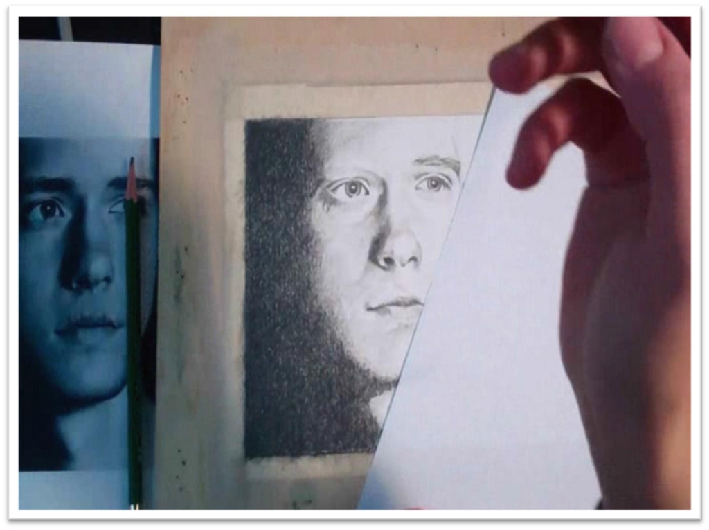
The last step is to make a side-by-side comparison between the reference photo and your finished drawing.
By isolating one small square of the picture at a time, you’ll be able to pinpoint exactly where lines, shadow shapes, and tones need to be adjusted.
When the portrait is complete, carefully remove that tape. If you’re satisfied with your results, you can move to the next class.
Preserving Whites in Watercolor
Before you go any farther, take some time to practice basic watercolor techniques.
You have to know how to preserve whites by protecting them, preserving them, or lifting them out.
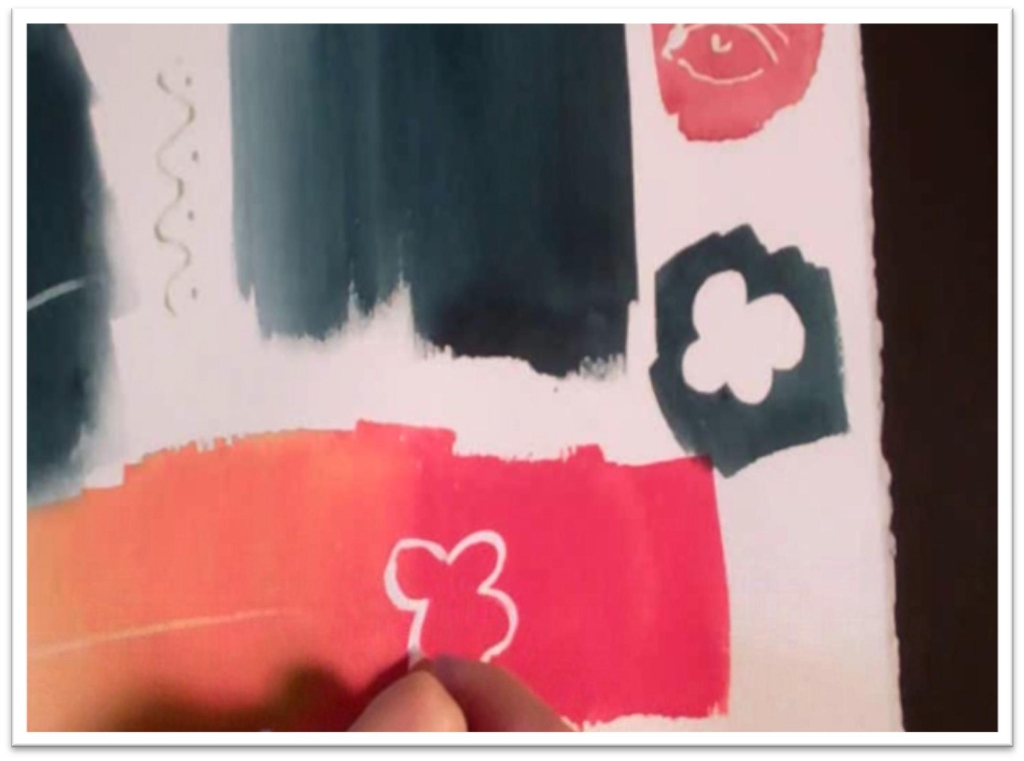
Use masking fluid, which comes in a pot or attached to a needle tool for intricate line work, to preserve whites on watercolor paper.
Just paint or spatter it on, let it dry, and paint over the top. You can also use frisket film for a similar effect.
Masking fluid is like rubber cement, whereas frisket film is more like contact paper.
Both materials are good for preserving intricate details or precise shapes. When you need to keep a large area white, protect it with paper or water mask.
Water masking can be done for either positive shapes or negative ones, and the process for either is the same.
Just paint the paper with clean water wherever you want the paint to go, then flood the wet area with paint.
This technique is based on the principle that the paint will follow the water, and it’s wonderful for large or small areas when you’re using a fairly controlled method. You can also preserve whites by lifting, or scratching them out.
To lift, simply dampen a flat brush and rub out the area you want to lighten, then blot with a paper towel. It works best for lifing angular shapes; straight lines, grasses, etc .
This will give you a different effect than scratching out, which is best for very small lines or dots. The drawback to scratching is that you risk damaging the paper.
The last way to preserve whites is to paint them on. If you wait until the painting is dry, those whites will be bright and read as highlights, whereas if you mix the white paint with other colours, you’ll change the paint from transparent to opaque.
It’s not bad, but it will alter the whole look of the painting, so be aware of that before you try it.
You can also use a tinted cover-up product, like Aqua cover, which is tinted to match the precise white of your paper.
If you don’t have frisket film, you can use masking tape or curve tape and just cut it down to the size you need.
Masking tape won’t work as well as frisket film for drawings, however, because it won’t allow you to blend over the top without a ridge.
Also, if you use masking tape, make sure to stick it to something else (like your clothes) to make it less sticky before you put it on your paper. Drawing paper, especially, is prone to tearing.
Preserving Whites in Graphite
You also need to know how to preserve whites in graphite before going any farther, so in this class we’ll practice shielding, erasing, and indenting the paper.
Shielding is similar to what you do in watercolor, using either frisket film or tape to preserve precise lines, curves, and shapes.
You can also use stencils, either store-bought or ones you make yourself by cutting shapes out of frisket film or tape.
When the area around the shape is protected, you can fill the tone of the shape in without having to outline.
Blend your tone to the value you want, and when you remove the frisket, the edges will be perfectly preserved.
Similarly, you can preserve a clean edge by using tape. Just make sure that you go all the way to the tape with the tone, leave it in place while you blend, and when you pick it up, the line will be perfect.
You can use an eraser shield to similar effect, only in that case, you will put down the gradient tone first, then erase the shape out. This will only work when the tone isn’t too dark.
Either buy eraser shields, or make your own from cardstock. You can preserve tiny lines or shapes by indenting the paper with a blunt, fine stylus.
After indenting, you can lay tone right over the top with any pencil you wish and those lines will be preserved. The only concern here is that if yo make a mistake, it’s very difficult to fix, so use this technique carefully.
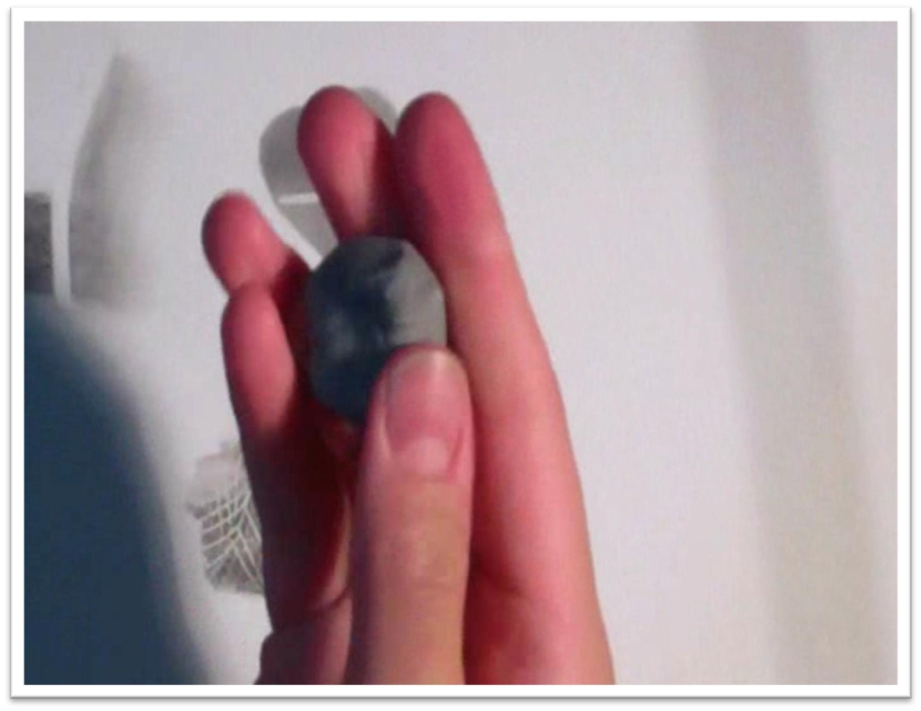
Finally, you should also give yourself some time to practice using a kneaded eraser to slice out thin lines, erase mistakes, and blot out tone to even lightness. Beginners are often hesitant about mashing up their kneaded eraser for some reason.
Don’t be. You can’t use it to best effect if it’s wrapped up in plastic or if you’re only using one tiny corner, so unwrap the whole thing and mash those pristine edges up.
You clean the eraser by squashing it, pulling it, and re-shaping it after you lift the graphite, and after a while, this will become second nature to you.
An electric eraser is another option for small, precise details, and it’s worth the money to invest in a good one.
Work on these techniques on a piece of scratch paper, and when you know how to preserve whites and are comfortable with your erasers, move forward.
Transferring a Drawing or Painting with the Slip Method
This lesson will focus on one method of transferring a drawing to watercolor or drawing paper.
This is called the slip method, because it involves slipping the paper back and forth.
This is an alternative to tracing, which will come in handy when you’re working on opaque material or tracing isn’t an option for some whatever reason.
Begin with a reference photo that is the exact size you want the finished piece to be.
Then cut off the margins (if there are any,) and mark off a picture plane on your watercolor or drawing paper that is the same size as the reference. Tape those borders and attach the paper to a sturdy surface.
Now place the reference material on the drawing paper, make sure that the corners all match up, and choose a place on the outline of the portrait to start.
Place your pencil right above that point, make sure not to let it move, the slip the reference off the top and mark that point on your drawing paper.
Choose a second point that connects to the first one, mark it on your drawing paper the same way, and then you can carefully draw the line between the two, referring to the reference as you work.
You can give yourself as many points to refer to as you wish, just make absolutely certain that you line up the papers and keep your hand still when you whisk that paper away, and you shouldn’t have any problems.
The less comfortable you are with drawing, the more reference points you should use. You can place them wherever you want.
This is a simple technique, but an invaluable one, and one that you certainly need to practice.
It does take time, but probably not as much as you think. As in all of our lessons, one of the key things you’re teaching yourself in this class is patience.
If you take the time, your picture will be photorealistic, but most people get frustrated or lazy or bored and don’t create the artwork they’d like to. Practising exercises in patience will help you create the best art you can.
Transferring a Drawing or Painting with the Grid Method
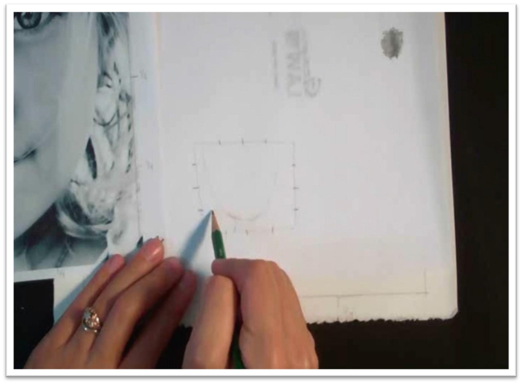
To use this method, you once again need start with good, clear, reference material, but it doesn’t necessarily need to be the size of the finished piece, because the grid system will allow you to size the drawing up or down.
On the outer margin of the reference material, find the horizontal and vertical centres and mark those points on all four sides.
Then, find handy marks between those that will divide the reference into a grid. I give myself between six and eight marks per side. It’s essential that these line up with each other from one side to the other.
Your finished drawing paper needs to have the same proportions as the reference material, but once again, it doesn’t have to be the same size.
Once you’ve chosen a size for the finished piece, use a straight edge to determine the borders, and then translate the same marks from your reference material onto the drawing paper.
So, you need to find the centre, vertically and horizontally, of the drawing paper just as you did for the reference photo, and you need to find the same in-between marks as well.
The idea here is to set up a grid of reference points that translate from the photo to your drawing precisely. Once they’re in place, you can use them to quickly transfer the lines of the portrait.
You can label those reference points to make it easier to know where you are as you draw— numbers or letter work equally well; just use something so you can quickly find your place.
Using the grid, transfer the lines of the portrait. Start with the outermost lines–the top, bottom, and sides of the head.
When those are placed, move inward and establish the smaller shapes like the hair, ears, and neck.
You can then use the grid as well as those other shapes to help you to accurately place the eyes, nose, and mouth.
You should give yourself a vertical and horizontal measurement for every point that you place.
For instance, the top of the head might be one fifth of the way down the paper on the vertical axis, and right in the centre on the horizontal axis.
You need to know where it is in terms of both axis before placing it on the drawing paper. Finish the whole portrait this way, and then you’ll be ready to start developing the tone, which we will do in a later class.
Matching Skin Tones and Seeing Values
Now we’re going to match skin tones using just red, yellow and blue.
This is a great exercise for training your eye to match color, as well as teaching how to make realistic skin tones that have life and vibrancy. Start by activating three puddles of paint:
one red, one yellow, and one blue. I used winsor red, winsor yellow, and cobalt blue, but they aren’t the only hues that will work.
Experiment in your studio and see what you like best.
Next, get a punch card of watercolor paper and tape it to your skin on the arm you don’t paint with.
You’re going to layer the three colors in wet washes until you match your skin tone. Start with the color that’s strongest in your skin.
I used yellow, but that might not be your skin color. When that first color is still wet, layer the color that it needs to get it closer to your skin tone.
If you start with yellow and mix in blue, the color will turn green. If you add red, it will go more orange. Paint a third color on top of this one, and then a fourth.
The colors will change with the concentration that you paint them with, so if it gets too opaque and muddy, start over with a fresh piece of paper.
Keep in mind that your paint will dry lighter than it looks when wet. Work that way, layering one color over another, until you get the desired result.
You won’t always paint them on in the same order, and you don’t always have to use all three colors.
Let the circumstances dictate what’s needed. You also need to train your eye to see the difference between tone and color, which is crucial in matching reference material (or live models, for that matter), to create absolutely true-to-life portraits.
Get this skill down, and you’ll have no problem colorizing black and white portraits or vice versa, and as an added benefit, you’ll be a much better judge of whether or not you’ve matched a tone without using punch cards and value scales, and you’ll be able to work faster and more accurately.
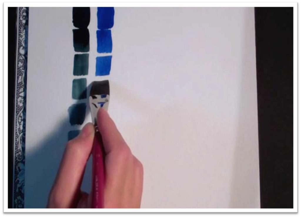
So even if you’ve done these before, I want you to take the time now and make four value scales, one in black, one red, one yellow, and one blue.
Each scale should have between six and ten steps of gradation. Start with the black, and make your first square the blackest you can make it.
The next square down will be just a bit less intense, the third one less intense still and so on and so forth until your last square is the lightest it can be.
The tricky part is making the steps gradual, and in matching the colors to the tones. So in the the next value scale, when you’re painting in color, you’ll be looking at the one you just finished in shades of gray and matching the equivalents in red, yellow, and blue.
You need to understand that every color, including yellow, has a value 1, a value 10, and every step in between.
This is not as easy as it looks. You have to actually do the exercise to get the benefit, so don’t skip forward until you have four value scales, and they’re done well.
Number them and use them as reference for your paintings and drawings in the future. It will save you having to buy a value finder later.
Matching Tones to a Black and White Portrait
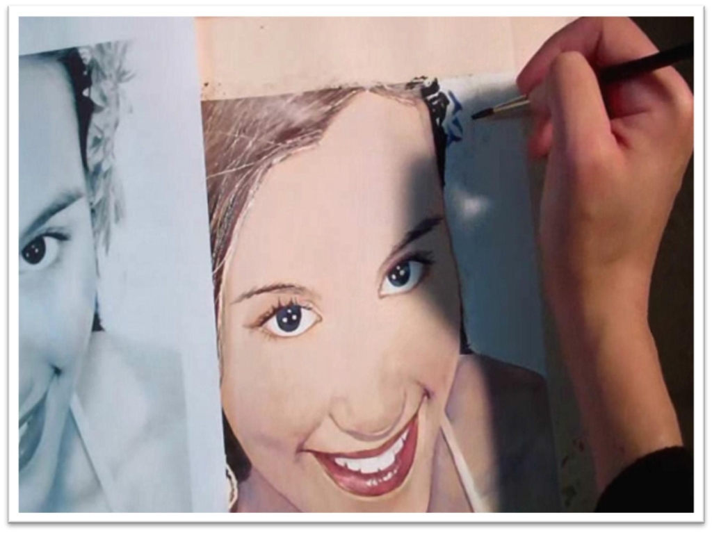
In this class we’ll concentrate on matching black and white tone in a portrait using only red, yellow and blue.
This is the method of matching the skin tones applied to a whole portrait, so if you weren’t completely satisfied with your results in class eleven, go back and try again until you are.
Trace the image onto your watercolor paper using the method of your choice, then wash over all the skin tones with clean water.
Carefully paint around the whites, like the eyes and teeth, so the paint will run around them (remember water masking?).
Paint a thin layer of yellow over all the flesh, and while that’s still wet, add a layer of watery red.
Touch into the shadow areas with a bit of blue, and work that way until the base tones are the right value. Use a value finder to double check your tones, then let that dry.
When the base tone is dry, you can darken the shadows using the same process. Blue is a good bet as a first coat in the shadows.
Paint the large shape of the shadow with as large a flat brush as possible, then wash out the brush and squeegee out the excess water with your fingers. Use that slightly damp brush to blend out the edges of the shadow shapes.
To avoid bleeds and muddy color, let the layers dry between each new application. When the shadow shapes are dry, you can work on the features of the face.
You’re still only using red, yellow, and blue, even for the darks. For the darkest tone, mix up blue and red to make a rich purple and add some yellow to darken it further.
See the shapes of tone as shapes that you can paint in one piece, which will ensure a realistic, even tone.
For details in the eyes and other small areas, you may need to switch to a smaller round brush, but for the most part, stick with the flat. Before you start painting the hair, use the masking fluid needle tool to protect some flyaway strands and lighter pieces.
Let that dry, and then paint in the base tone of the hair. Keep it from getting boring by letting the color mix on the paper, or at least mixing multiple color into the wet paint.
When the base tones are in place, you can paint in the shadow shapes the same way you did in the skin tone.
Let that dry, and you can remove the masking fluid. Finish with the final details in the small areas; the hairpiece, pearls, shirt strap, etc.
Just work slowly, painting what you see on the reference material. Don’t worry about making realistic color if you don’t want to; your only job in this class is to match the tones.
Rest and come back to the painting a few times as you’re working so that you can catch mistakes before they go too far.
Let it dry, and you can remove the tape. This may be a class that you want to try a few times with different reference materials.
The less experience you have, the higher contrast reference photos you should use, because intense lighting will reduce the number of details and the shading that you have to worry about.
Drawing a Photorealistic Eye
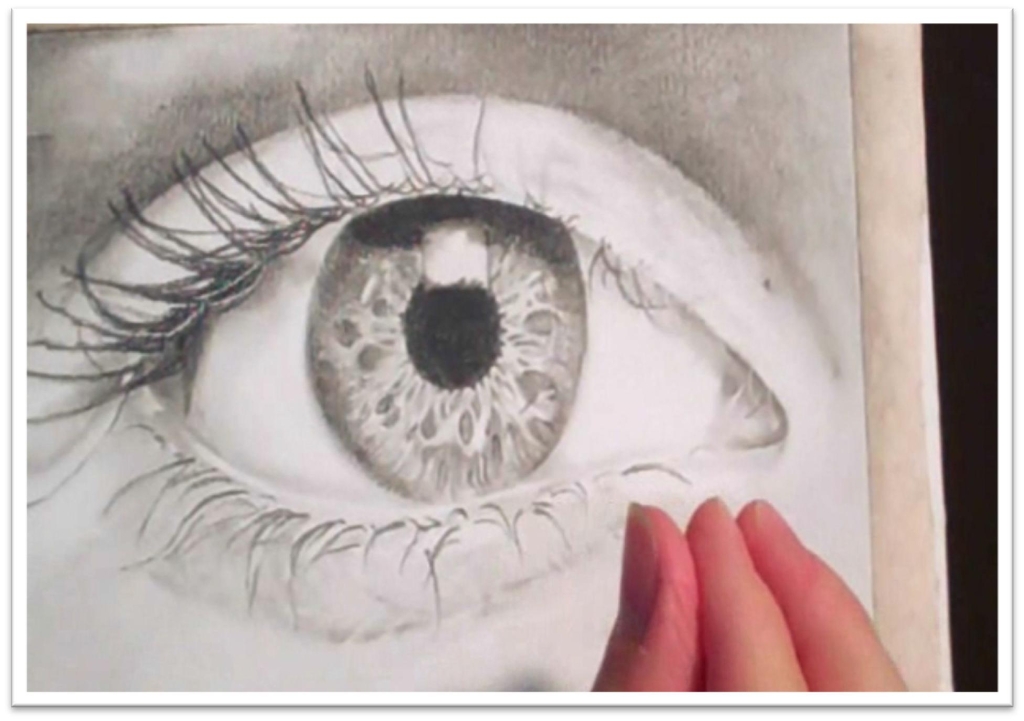
Before you dive headlong into a complete photo realistic portrait, you should focus on developing one small element. In this class, we’re drawing an eye in as high of detail as possible.
Begin with clear reference material that has high detail.
Enlarge it to the size of the final piece, and transfer the lines to your drawing paper using the slip or grid method.
Place the outer, largest shapes first, and work your way in. Indent the paper to preserve the small, white eyelashes and some detail in the skin if needed.
Use frisket film to protect the white highlight in the eye, then lay in the skin tone of the skin above the eye. Use the value finder to determine what value the color is, and translate that to your drawing paper.
After the first pass of base tone is down, blend it smooth with the chamois cloth, then darken the skin a second time with a softer pencil.
Don’t be afraid to move the paper as needed to accommodate your wrist movement. Blend the second pass with a large stomp or tortillon.
When the skin around the eye is complete, start laying down some tone in the eyelid. Lay down tone following the contours for a realistic effect.
After the eyelid skin is smooth, use a sharp, soft pencil to add the individual eyelashes. Then you can move to the pupil and iris.
Make the pupil as dark as you can, then add a base tone to the iris. Blend it smooth, then slowly add the details that you see in the iris.
There’s a lot there, so take your time and make sure that you’re continually looking at the reference material.
You’re trying to copy what you see exactly, both the lines and the tone, so it will take great care.
Use the kneaded eraser to pull out small highlights on the underside of the eyelid right against the eyeball, which will help it look like the eyelid sticks out.
When all the details are done to your satisfaction, carefully remove the frisket film in the highlight, then protect the working surface with a clean sheet of paper and add the details in he highlight.
In my specific drawing, there are clouds visible in the highlight, and I add the tone with a used tortillon, which is faster and more efficient than using a pencil and then blending.
This is a good method to use when adding shadows to very light areas. When the drawing is complete, carefully remove the tape around the outside and look at it from different distances.
t’s easier to catch mistakes when you give yourself some distance and time away from the piece, so keep that in mind as you work.
You can follow this same process to develop other parts of the portrait as well. Anything that you devote time and patience to will be good practice for a finished portrait.
Painting a Photorealistic Eye
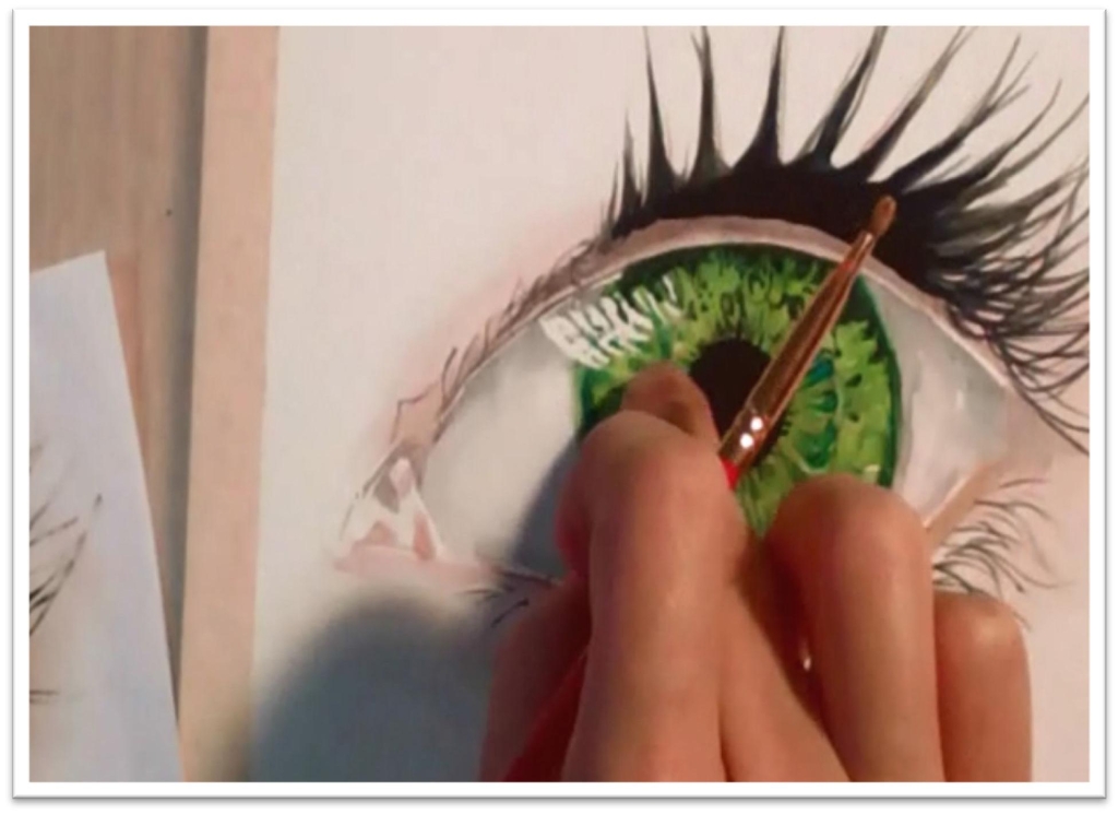
Now you’ll be painting a photorealistic eye.
Trace it with the slip method, then use masking fluid to mask the crucial whites, like the highlight in the eye, etc.
Mix the color for the skin color by putting a swatch to test on right against the reference material, and don’t start painting until you’re certain about the color.
Paint the skin tone, then soften the edges with a slightly damp brush. Let that dry, and then add the shadow shape. Soften the edges of the shadow as well.
Make sure to check every new color before you put it down, and that will save you time in the long run.
When the skin is done, move to the iris color. There will be more than one shade of green (or whatever the color is), so mix and match each color.
Begin by painting the lightest one, painting in the direction of the spokes in the iris, then add some color variation while that’s still wet. Let that color dry, and then lift out some color with a damp brush if needed.
Add the darker color on top of that, and let it dry again. In the meantime, you can add some additional detail in the corners of the eye, and some shadow to the white of the eye.
Pay close attention to the areas of reflected light. It’s those small details that will push the realism up to the next level.
When the iris color is dry, use a straight Payne’s gray or indigo to paint the pupil.
Carefully outline it first, then fill in the centre.
There are some tiny spokes moving outward from the pupil, which you can put in either by painting them with a small round or by scratching through the wet pupil with the edge of the brush handle.
Put the eyelashes in by painting the base shape first, then use a rigger to paint a few individual hairs. Paint them in the direction of their growth for the most realistic effect.
Remove the masking fluid or frisket film, and then add the final details. You may need to soften the harsh edges of the spots that were protected so they don’t become targets, and when you paint shadow shapes, make sure to check the color carefully before you paint them.
This isn’t a matter of skill, its pure persistence. This exercise is excellent practice for developing patience, building your skill to see and match tone, and honing all the painting skills that you’ve learned up to this point.
Paint more than one eye if you wish, or practice putting that much time and effort into a nose, mouth, or eyebrows. You’ll be surprised at how much detail there is in everything you see if you just pay attention.
Elements of Composition
Now let’s take some time out to examine the elements of composition.
Composition can be difficult to discuss, because while the extremes of good and bad are easy to spot, everything else can become muddled and unclear.
In general, you’ll know you have a problem with your composition if your eye doesn’t want to see everything in the picture.
That’s not to say that everything will be equally exciting, but there shouldn’t be any dead, boring patches in your composition that the eye just doesn’t want to travel to.
Also, if there’s one thing that you always look at first everytime you see the picture, you probably have a compositional problem.
And finally, if your eye seems to be led out of the picture, that’s another indication that there’s a problem. A picture should invite you in and keep you there.
If it doesn’t, there are a few common problems that you might be able to identify as the reason why it doesn’t.
Simply put, these are:
- Cutting the picture plane in half, either horizontally, vertically, or diagonally.
- Cutting off a corner
- Filling the picture plane inappropriately, with a subject that is either too big or feels “lost in space,”
- Setting up objects that create tension, or
- Creating targets in the picture.
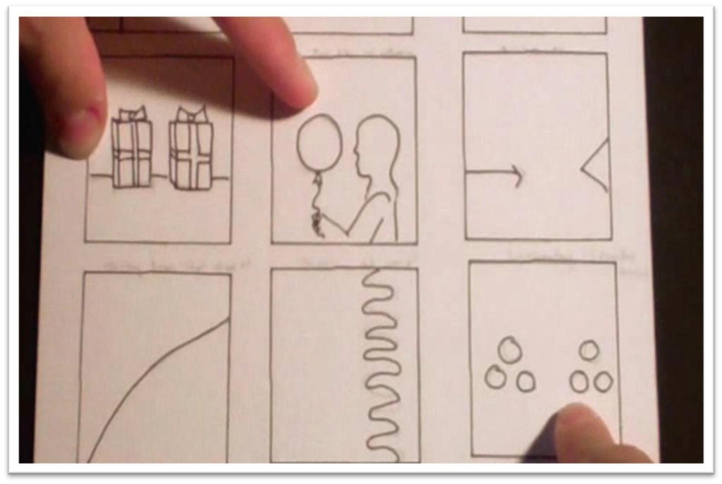
Tension is created when objects are lining up at the same spot, juxtaposed one against the other, too close in size, number, or mass, or parallel to one another.
And keep in mind that you break these rules not only by doing obvious no-no’s, like putting your horizon line dead centre in the page, but also by misplacing shapes, shadows, and even gradients of color.
The eye is attracted to areas of high contrast, high detail, and intense color. So don’t look only for physical lines and the problem in your composition–it could be anything
A target is that place that your eye is always drawn to first, over and over. It could be a bright patch of color that doesn’t occur anywhere else in the picture, or a line that’s too dark, or a cloud that looks weird.
Your focal point shouldn’t smack you in the eye; rather, it should feel natural, and it should blend into the rest of the piece.
Think of a painting as a piece of music. Even if you had one really great trumpet player, you wouldn’t want a random trumpet solo popping up in the middle of a piano concerto–it doesn’t fit there.
Similarly, if you have one thing that sticks out in your picture, no matter how fantastic it is individually, it will ruin your piece.
You can put these to work by getting some copies of masterpieces and ruining them using a piece of acetate and painting over the top at critical points.
Also, flip a masterpiece upside down to force your eye to see the elements as abstaract shapes, and make a rough abstract drawing of the painting to see why the composition works.
Doing it this way will make it a lot easier to spot the problems or strengths, and it’s good practice to get into with your own work.
If you’re unsure whether or not your composition is working, try turning it upside down and sketching the abstract
Use acetate film to test changes without ruining your work, and you’ll soon see great improvements in your art.
Painting an Abstract
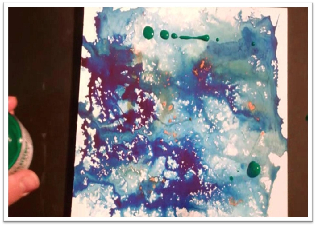
To really cement the elements of composition in your mind, take some time in this class and paint a few abstract paintings.
Abstracts are pure composition, and for that reason, they can be very challenging for artists who like to stay realistic and representational.
But I can’t stress enough the importance of getting solid composition down before you spend hours and hours on a photorealistic portrait.
You need to get to the place where you can sense problems immediately and fix them before they ruin a whole painting or drawing.
So practice on a small piece of watercolor paper or illustration board, and to begin, just start flinging two or three colours around.
Make it easy on yourself and don’t spend too much time planning; if you can find the strongest composition in the finished painting then you’re doing what you should be.
But as you work, do keep in mind those common problems and do what you can to avoid them.
Don’t use a color in just one place on the paper, or you’ll have a bullseye. Be careful of strong lines and shapes that compete with each other, etc.
While the first painting is drying, pick up a second sheet and try again. You might try a different technique this time; flinging concentrated dots of color around and then spraying them with a water bottle can give interesting effects, and you can add more texture by scratching through the surface, adding salt to semi-dry paint, stamping with a wad of paper or towel, or any other number of things.
When the paintings are dry, turn it different directions, use L-mats or your hands and crop it, and try to find the strongest composition for each one.
Identify problem areas and see if you can do anything to resolve them. Remember, it’s a lot easier for you to this work on a painting that took five minutes as opposed to fifteen hours, so do your homework now and you won’t have to pay for it later.
When you feel that you’re capable of putting together a good composition, you can move forward to your last phase in the course: putting everything together to develop some finished portraits in watercolor and graphite.
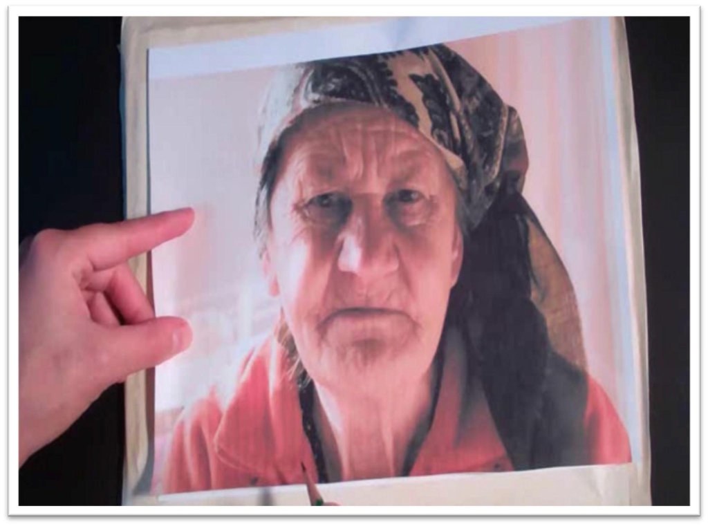
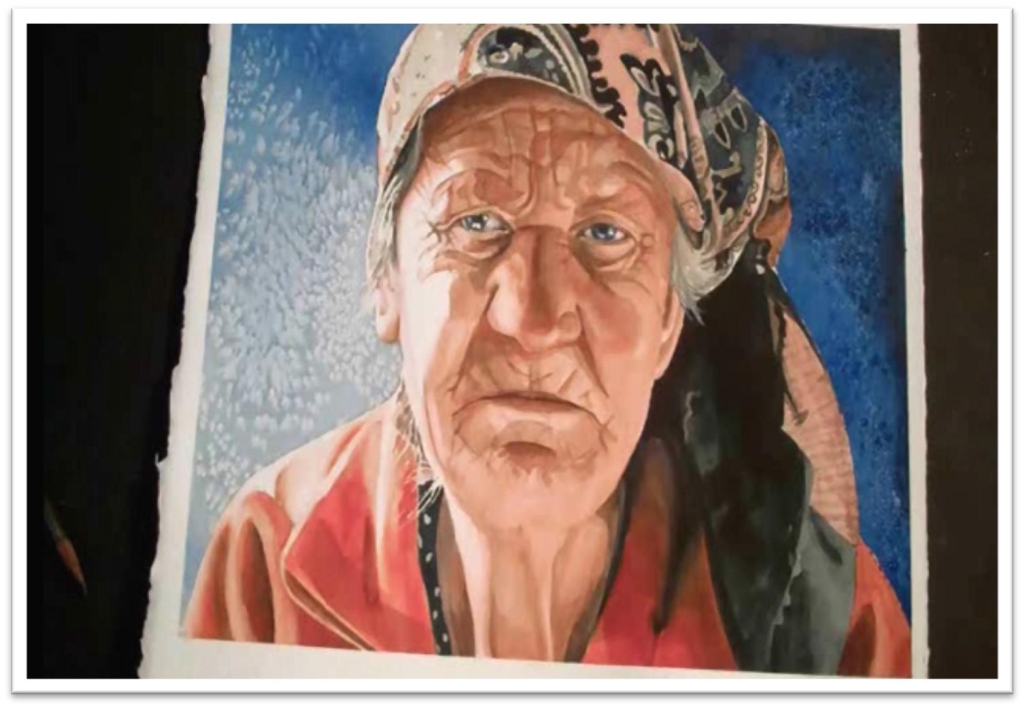
Painting an Elderly Woman’s Portrait in Watercolor
In this class we’ll be putting it all together to make a complete, finished portrait.
This class is a continuation of the picture we started in learning how to transfer drawings, so we can dive right into the painting.
To begin, use a piece of acetate and experiment with some different color in the background.
Make sure to adhere to the lighting conditions when you choose a background; one side should be brightly lit.
When you’re satisfied, tape the edges of her arm and wherever else the portrait will be meeting dark color in the background, then paint the background.
I salted the paint when it was still damp to add texture.
When the background is dry, remove the tape on the clothing. You can now get started in the flesh tones, which you can paint either very slowly and carefully, mixing up each color and matching it to the portrait before you wash it in, or by layering red, yellow, and blue in wet washes.
In the video, I use the careful approach, but let me emphasize that this is not the “right” way; it’s one method that works, and you should know how to do it so you can use it when it suits you.
Painting carefully will mean using many swatches of test papers to make sure the color is right for every part of the painting before you put it down.
Don’t assume that the face will be the same color in different places; light and shadows will change the color.
Put the wrinkle lines in first, re-drawing them in pencil before you start if necessary.
You need a good, clear reference. Paint them very dark, as they will be lightened in the next step.
When the wrinkles are dry, mix up a flesh tone and wash it over the top, being sure not to cover your whites. Remember the blending techniques you practiced and use those to soften the edges of your wash.
After the base flesh tones are down, you can add detail to the facial features. Much of the work will already be done in the nose and mouth, but you’ll need to spend some time with a small round brush darkening the eyes, nostrils, corners of the mouth and so on.
Next, move to the clothing. There is a big difference in color from the dark side to the light, so match swatches of both colours before you start.
Once the colours are correct, though, the process is just the same as painting the flesh tones.
Put down the base tone, avoid highlights, soften the edges, and ALWAYS check and double check the reference material to be certain your lines, shapes, and colours are correct.
Paint the design in the headscarf the same way. This is mostly a complicated design with few areas of solid color, but put in the large shapes and then develop the details on top, working slowly and carefully to match the lines.
Don’t start that design until you’re satisfied with your pencil drawing, or you’ll get lost when you try to paint it.
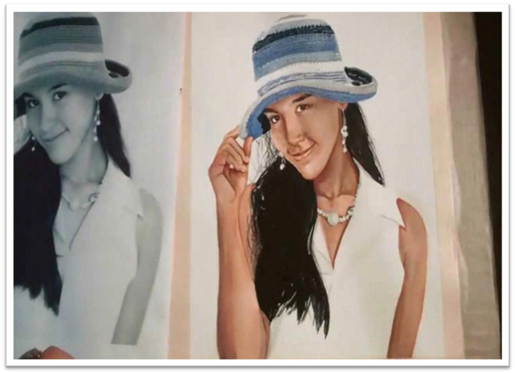
Painting a Young Woman’s Portrait in Watercolor
Transfer your drawing to the watercolor paper using the grid or slip methods, making sure to preserve your borders by drawing them and then taping them with masking tape.
Your watercolor paper should be fixed to a firm backing, like a piece of plywood or gatorboard.
Next, protect your whites in the eyes, the necklace, and other small details.
To paint the flesh tones, wet the entire skin tone with clean water using the largest flat you can for the area.
Don’t forget the arms. Start with a yellow, making sure that’s not too intense, or the finished skin tone will be dark and muddy.
Layer over that with a thinned down red, then add some blue to the shadow shapes. You might need to go over the top one more time with the red.
Get plenty of color on the paper, or you’ll have to do it all over again when the paint dries and lightens.
After the skin is dry, clean up any messy lines with a damp, angled brush, and use the same technique to pull out some lighter areas on the face as needed–the chin, neck, collar bone, and so forth.
Because you don’t have a color photograph to work from, you’ll need to concentrate on matching tones, not colours.
Continually compare your painting to the reference material. Even if the painting looks okay as it is, make adjustments until it looks exactly the same.
It will help to use two small swatch squares with the holes punched out to make minute, side-by-side comparisons.
Add detail in the facial features with a small round. There’s no trick to it other than working slowly and checking your tones and lines against the photograph. Then you can move to the hair.
Mix up a color dark enough to match the tone in the photo, and then paint in the large shapes first, using the flat brush.
When the large shape is in place, paint a few flyaway hairs with a rigger brush, and when you get to the bottom of the hair use a quick, brushy stroke to make those tips uneven.
When the paint is wet, mix more than one color into it to add relief and interest. When the hair is dry, remove the masking fluid and soften the edges as needed.
Pay close attention to the very faint and subtle shadows that play on the form.
There is often a line of reflected light around the outside of round edges, and this light helps make the shape three-dimensional.
Add shadows to the hand, arm, and wherever else they’re needed, and then move to the clothes.
The shirt is white and so has low detail; there are just a few subtle shadows to put in and you can call it good.
Before you start the work in that high-detail hat, however, take a few moments to study its construction.
Try to memorize the pattern of the weave to make it easier for you to paint without having to double check every brush stroke against the photo.
When the hat is done, remove the masking fluid and add a few shadows to give the pearls and earrings some depth and dimension. After that, the portrait is complete and you can remove the tape.
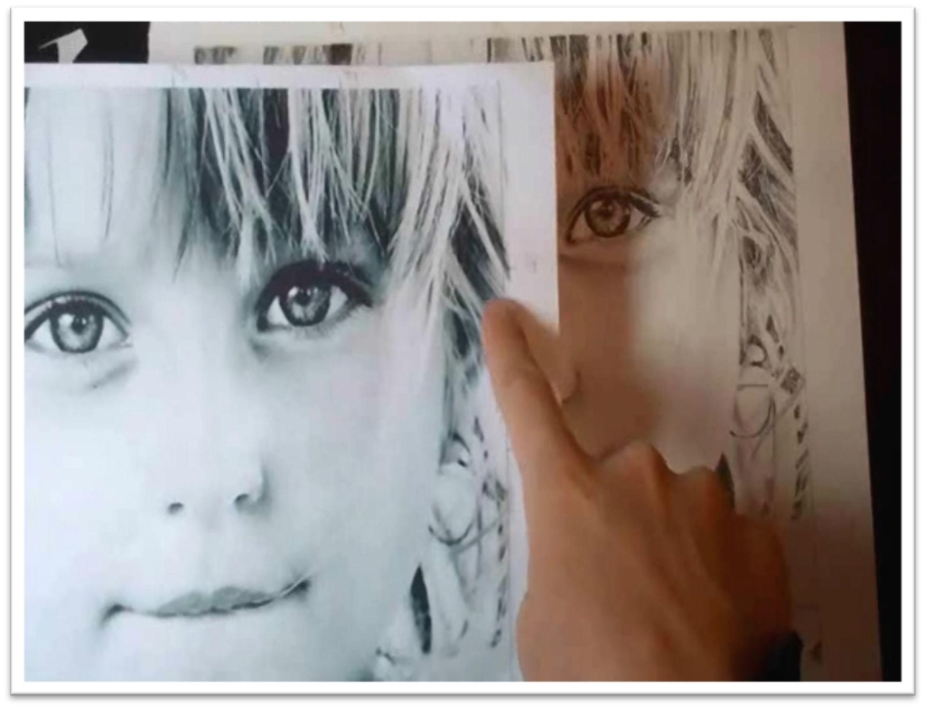
Drawing a Child’s Portrait in Graphite
We’ve already done the prep work for this piece, so all that remains is to add the tone.
Begin by determining the values that you’ll need to match, and you can begin placing in the tone of the face.
Because this skin tone is so light, begin with a 2H pencil and add a light coat of tone, then blend them smooth with the chamois wrapped around your finger.
When you’re done with one pass of blending, you’ll need to use a softer pencil and add a second layer of tone to the darker shadow shapes. After this second pass, blend the tones with a stomp or tortillon, which won’t lift up so much of the tone.
When the skin is done, begin work on the features. Use a very sharp 4B pencil to darken the lines in the iris. To keep the whites of the eyes perfectly bright, protect them with frisket film.
Once the film is in place, you can darken right over the top of it, which will give you a smooth, uninterrupted tone.
Add the details to the eye. This will be easy after drawing and painting a photo realistic one!
Use what you know and what you see to slowly develop realism in the eye, putting in the lines in the iris and then blending that tone smooth with a small tortillon.
You can follow the same process to darken the nostrils and lines between the mouth.
When you’ve put all the dark tones in the eyes, pull up the frisket film and add the delicate shadows to the whites of the eys. You can also add the eyelashes now.
Remember, draw each lash with one stroke and work from the base to the tip.
Next, move to the hair. Because there’s so much emphasis on the hair in this portrait, you’ll need to be very careful. If the tiny white hairs aren’t indented, make sure they are before you start adding tone.
Then use the grid system (it should still be visible around the reference photo and on the tape of your drawing paper) to help you place the dark shapes in the hair.
Get the big, dark shapes in place first, and then you can use them to help you place the other shapes. Then it’s just a matter of taking some serious time and putting those details in.
Protect the side of the face wherever it butts against extreme darks to keep that line crisp and straight; be sure to stick that tape to something else first, or it could tear your paper when you pull it up.
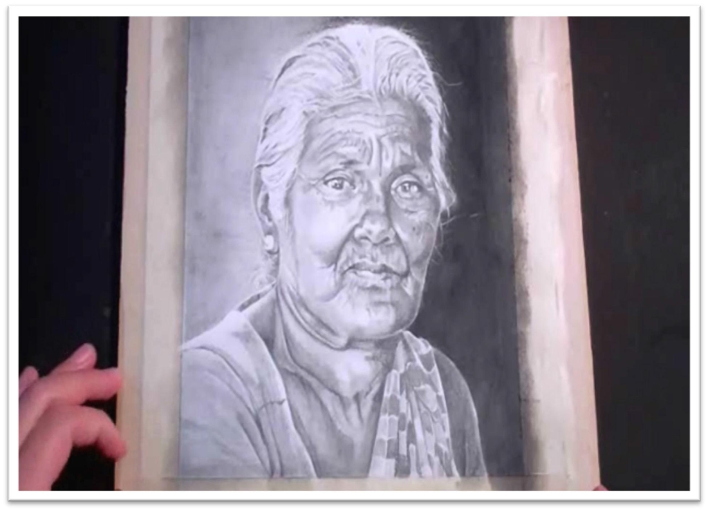
Drawing the Portrait of an Elderly, Indian Woman in Graphite
This drawing will present two challenges: dark skin and wrinkles. Begin with the rough sketch.
Blow up the reference material and set up your grid for the grid transfer system.
Remember, you’ll want reference marks on both the vertical and horizontal axis before you place any lines.
Take your time and make a sketch based on careful, accurate measurements.
Darken the lines so they’ll be easy to trace, then trace them onto your drawing paper. Make sure to preserve your borders!
Tape those off when you attach the drawing to the sturdy backing, such as ply board. If you do use wood, don’t forget to pad the board with a few pieces of scratch paper, or that wood grain will disrupt the drawing.
Protect the edges of the face that touch the dark background, then follow the familiar procedure to darken up that background until you’re satisfied.
Cross-hatch the tone three or four times, using a steady pressure to keep from making lines, and blend clear up to the tape or your line won’t be preserved.
Use the value finder to determine how dark the base tone of the skin should be, then put that down with a B or 2B pencil.
Put that down using the pencil on the side, making sure not to scribble, then blend it with the chamois cloth. You always follow the contours of the face, whether adding tone or smoothing it.
When the base skin tone is correct, add shadows. Look for the shapes of shadow and put them down as shapes, then blend out the edges to keep them from looking artificial. Blend them with the largest stomp or tortillon you can use for the area to help ensure a smooth tone.
Next, add detail to the eyes, nose, and mouth. As you work, you should constantly be checking and re-checking your drawing against the reference photo.
Use the punched out cards to compare small areas against each other, and use your value finder to check your values against the photo.
After the skin is done, you can move up to the hair. Because the hair is white, you add detail by first blending a very light coat of solid tone over the entire shape of the hair.
Then, use the kneaded eraser mashed to a blade to pull out individual hairs, making sure that you follow the direction of hair growth that you see in the photo.
Then add the dark shapes in between the individual hairs. This will take a long time, so take breaks to keep from getting impatient and rushing yourself.
When you’re ready to move down to the clothing, protect the line that divides the shirt from the sash, then use the value finder to determine the value of the shirt.
Put that tone down with a soft graphite pencil. You may even need to paint the graphite on with a brush to get it dark enough.
But when the tones are dark enough and blended and the wrinkles are in place, lift up that tape and start work on the checked pattern in the sash.
Start with a clear outline for the shapes, then work block by block, matching the tones to the appropriate colours.
Add the dark shape of the wrinkle over the top, and blend each block with a small stomp or tortillon.

